Your graphics add a nice touch to my presentations and I recently used them for one of my all-hands meetings. Your toolbox adds professionalism to my slides. Instead of using standard clipart.
Claude Jones, Director of Engineer, @Walmartlabs, USA
Your graphics add a nice touch to my presentations and I recently used them for one of my all-hands meetings. Your toolbox adds professionalism to my slides. Instead of using standard clipart.
Claude Jones, Director of Engineer, @Walmartlabs, USA
I needed a fresh look at some of my slides. I've tried to find a way to create a paintbrush effect, to underline, accentuate, add some color and the handwritten markers were just the things. Very easy to use, easy to size, change the color. It was an affordable, perfect solution and I'm happy to recommend it.
Anonymous, US
The crisp, clean look of the graphics, and the fact that it allowed me to easily edit and change the colors to match the template was my main reason for purchasing them.
Brandie Jenkins, E-learning Developer, USA
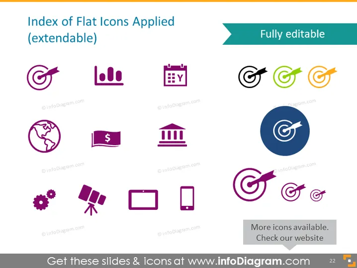
Die PowerPoint-Folie mit dem Titel "Index von flachen Icons (erweiterbar)" präsentiert eine Sammlung von 12 flachen Design-Icons. Diese Icons stellen verschiedene Konzepte dar: Ein Zielsymbol repräsentiert Ziele oder Vorgaben; ein Balkendiagramm-Icon zeigt Datenanalysen an; ein Kalender steht für Planung oder Zeitrahmen; eine zweite Gruppe von Ziel-Icons in verschiedenen Farben deutet auf Anpassungsoptionen hin; ein Globus exemplifiziert globale Reichweite oder internationale Angelegenheiten; ein Rechnungssymbol steht für finanzielle Themen; ein Banksymbol bezieht sich auf Finanzinstitute; ein Zahnrad repräsentiert Einstellungen oder Mechanik; eine Satellitenschüssel impliziert Kommunikation oder Rundfunk; ein Monitor spiegelt Computer- oder Anzeigebildschirme wider; und ein Smartphone symbolisiert mobile Technologie. Es gibt auch einen auffälligen Kreis mit einem Ziel-Icon in der Mitte, das einen Brennpunkt oder ein Hauptmerkmal anzeigen könnte.
Die Folie hat ein modernes und sauberes Aussehen, das Einfachheit und Klarheit durch die Verwendung flacher Icons und einer begrenzten Farbpalette betont. Die farbigen Ziel-Icons setzen einen Akzent im Gesamtdesign.


