
Your graphics add a nice touch to my presentations and I recently used them for one of my all-hands meetings. Your toolbox adds professionalism to my slides. Instead of using standard clipart.
Claude Jones, Director of Engineer, @Walmartlabs, USA

Your graphics add a nice touch to my presentations and I recently used them for one of my all-hands meetings. Your toolbox adds professionalism to my slides. Instead of using standard clipart.
Claude Jones, Director of Engineer, @Walmartlabs, USA
I needed a fresh look at some of my slides. I've tried to find a way to create a paintbrush effect, to underline, accentuate, add some color and the handwritten markers were just the things. Very easy to use, easy to size, change the color. It was an affordable, perfect solution and I'm happy to recommend it.
Anonymous, US
The crisp, clean look of the graphics, and the fact that it allowed me to easily edit and change the colors to match the template was my main reason for purchasing them.
Brandie Jenkins, E-learning Developer, USA
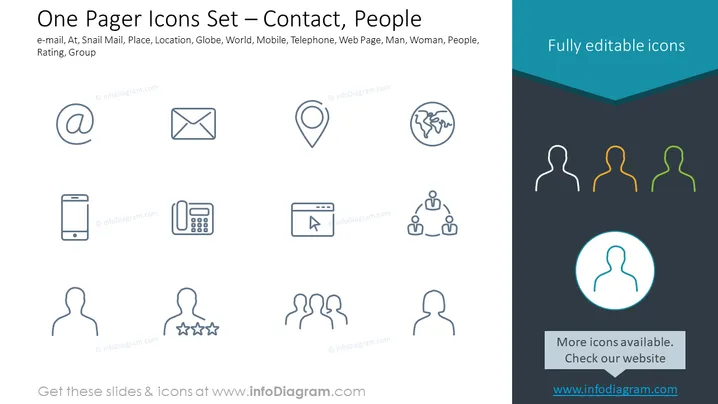
Die PowerPoint-Folie trägt den Titel "One-Pager-Icons-Set – Kontakt, Personen" und präsentiert eine Sammlung von Symbolen, die mit Kommunikation und sozialer Interaktion verbunden sind. Dazu gehören Symbole für E-Mail, Post, Standort, eine Darstellung des Globus, die die Welt anzeigt, Mobiltelefon, Telefon, ein Icon für eine Webseite sowie Figuren, die einen Mann, eine Frau, eine allgemeine Gruppe von Menschen, eine Bewertung mit Sternen und ein Gruppensymbol zur Veranschaulichung von Vernetzung oder Hierarchie darstellen. Jedes Symbol vermittelt einen bestimmten Aspekt des Kontakts oder der sozialen Verbindung, wie verschiedene Kommunikationsmittel (E-Mail, Post, Telefon), Möglichkeiten zur Darstellung von Standorten (Pin-Symbol), globale Interaktion (Globus), digitale Engagement (Webseite), individuelle Darstellung (Mann, Frau), Gruppendynamik (Menschen, Gruppensymbol) und qualitative Messung (Bewertungssterne).
Das Gesamterscheinungsbild der Folie ist modern und professionell, mit einem Fokus auf Einfachheit und guter Lesbarkeit. Der Einsatz konsistenter linienstilmäßiger Icons und einer begrenzten Farbpalette schafft ein elegantes und kohärentes Design.