

Your graphics add a nice touch to my presentations and I recently used them for one of my all-hands meetings. Your toolbox adds professionalism to my slides. Instead of using standard clipart.
Claude Jones, Director of Engineer, @Walmartlabs, USA

Your graphics add a nice touch to my presentations and I recently used them for one of my all-hands meetings. Your toolbox adds professionalism to my slides. Instead of using standard clipart.
Claude Jones, Director of Engineer, @Walmartlabs, USA
I needed a fresh look at some of my slides. I've tried to find a way to create a paintbrush effect, to underline, accentuate, add some color and the handwritten markers were just the things. Very easy to use, easy to size, change the color. It was an affordable, perfect solution and I'm happy to recommend it.
Anonymous, US
The crisp, clean look of the graphics, and the fact that it allowed me to easily edit and change the colors to match the template was my main reason for purchasing them.
Brandie Jenkins, E-learning Developer, USA
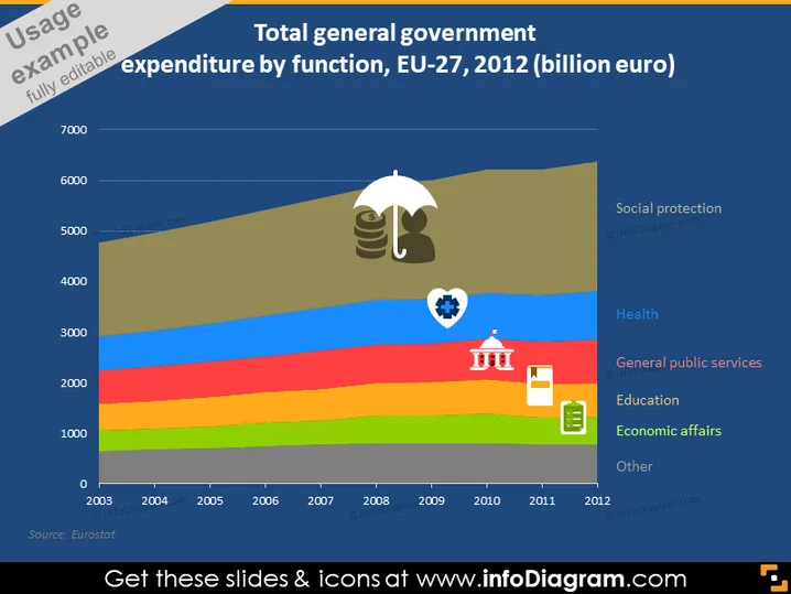
Die Folie zeigt ein gestapeltes Flächendiagramm, das die gesamten Ausgaben der allgemeinen Haushalte nach Funktion innerhalb der EU-27-Länder für die Jahre 2003 bis 2012 darstellt. Es unterteilt die Ausgaben in Kategorien wie Soziale Sicherheit, Gesundheit, Allgemeine öffentliche Dienstleistungen, Bildung, Wirtschaftliche Angelegenheiten und Sonstige. Jede Kategorie steht vermutlich für die Ausgaben in Milliarden Euro innerhalb dieses Sektors und zeigt Trends und Veränderungen über den angegebenen Zeitraum.
Das Gesamtbild der Folie ist klar und informativ, wobei die hellen Farben im Diagramm eine deutliche visuelle Segmentierung der Daten bieten. Die Symbole sind eine hilfreiche Ergänzung, um schnell jede Farbe mit der entsprechenden Kategorie der staatlichen Ausgaben zu verbinden.



