Your graphics add a nice touch to my presentations and I recently used them for one of my all-hands meetings. Your toolbox adds professionalism to my slides. Instead of using standard clipart.
Claude Jones, Director of Engineer, @Walmartlabs, USA
Your graphics add a nice touch to my presentations and I recently used them for one of my all-hands meetings. Your toolbox adds professionalism to my slides. Instead of using standard clipart.
Claude Jones, Director of Engineer, @Walmartlabs, USA
I needed a fresh look at some of my slides. I've tried to find a way to create a paintbrush effect, to underline, accentuate, add some color and the handwritten markers were just the things. Very easy to use, easy to size, change the color. It was an affordable, perfect solution and I'm happy to recommend it.
Anonymous, US
The crisp, clean look of the graphics, and the fact that it allowed me to easily edit and change the colors to match the template was my main reason for purchasing them.
Brandie Jenkins, E-learning Developer, USA
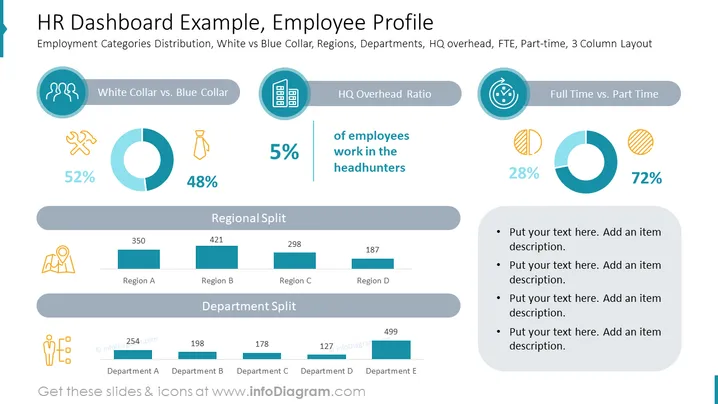
Die Folie präsentiert verschiedene Kennzahlen des Personalwesens in einem Dashboard-Format und hebt die Verteilung der Beschäftigungskategorien hervor, einschließlich Unterscheidungen zwischen Angestellten und Arbeitern, dem Verhältnis der Gemeinkosten des Hauptsitzes sowie dem Verhältnis von Vollzeit- zu Teilzeitbeschäftigten. Der Abschnitt "Angestellte vs. Arbeiter" zeigt eine nahezu gleichmäßige Aufteilung mit 52 % Angestellten und 48 % Arbeitern. Das "Hauptsitz-Gemeinkostenverhältnis" ist mit 5 % minimal. Schließlich arbeiten 72 % der Mitarbeiter in Vollzeit im Vergleich zu 28 % in Teilzeit. Es gibt auch Balkendiagramme, die die "Regionale Verteilung" und "Abteilungsaufteilung" zeigen und quantifizierte Daten über verschiedene organisatorische Divisionen bereitstellen.


