Your graphics add a nice touch to my presentations and I recently used them for one of my all-hands meetings. Your toolbox adds professionalism to my slides. Instead of using standard clipart.
Claude Jones, Director of Engineer, @Walmartlabs, USA
Your graphics add a nice touch to my presentations and I recently used them for one of my all-hands meetings. Your toolbox adds professionalism to my slides. Instead of using standard clipart.
Claude Jones, Director of Engineer, @Walmartlabs, USA
I needed a fresh look at some of my slides. I've tried to find a way to create a paintbrush effect, to underline, accentuate, add some color and the handwritten markers were just the things. Very easy to use, easy to size, change the color. It was an affordable, perfect solution and I'm happy to recommend it.
Anonymous, US
The crisp, clean look of the graphics, and the fact that it allowed me to easily edit and change the colors to match the template was my main reason for purchasing them.
Brandie Jenkins, E-learning Developer, USA
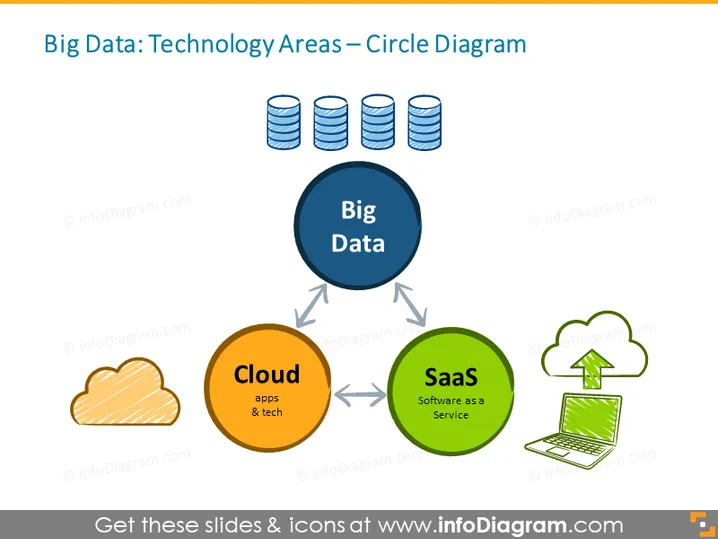
Die Folie konzentriert sich auf "Big Data" und die damit verbundenen Technologiebereiche, dargestellt in einem Kreisdiagramm. Im Zentrum steht "Big Data", das seine zentrale Rolle hervorhebt. Die beitragenden Sektoren sind "Cloud" (Apps & Technik), was die Nutzung von Remote-Servern für die Datenspeicherung und -verarbeitung impliziert, und "SaaS" (Software as a Service), was sich auf cloudbasierte Software bezieht, die über das Internet verfügbar ist. Jeder Bereich ist miteinander verbunden und symbolisiert ihre Abhängigkeit sowie die integrierte Natur moderner Daten-Technologie-Ökosysteme.
Das gesamte Erscheinungsbild der Folie ist klar und professionell, mit einem Gleichgewicht zwischen Text, Icons und Farben, um die Informationen effektiv zu vermitteln. Das kreisförmige Layout mit verbundenen Elementen betont das Konzept von Synergie und Integration innerhalb der Big Data-Technologie.


