Your graphics add a nice touch to my presentations and I recently used them for one of my all-hands meetings. Your toolbox adds professionalism to my slides. Instead of using standard clipart.
Claude Jones, Director of Engineer, @Walmartlabs, USA
Your graphics add a nice touch to my presentations and I recently used them for one of my all-hands meetings. Your toolbox adds professionalism to my slides. Instead of using standard clipart.
Claude Jones, Director of Engineer, @Walmartlabs, USA
I needed a fresh look at some of my slides. I've tried to find a way to create a paintbrush effect, to underline, accentuate, add some color and the handwritten markers were just the things. Very easy to use, easy to size, change the color. It was an affordable, perfect solution and I'm happy to recommend it.
Anonymous, US
The crisp, clean look of the graphics, and the fact that it allowed me to easily edit and change the colors to match the template was my main reason for purchasing them.
Brandie Jenkins, E-learning Developer, USA
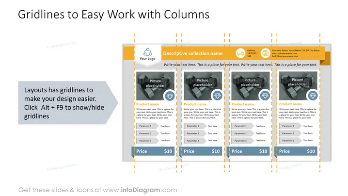
Diese PowerPoint-Folie mit dem Titel "Rasterlinien für einfaches Arbeiten mit Spalten" ist so gestaltet, dass sie ein Layout zeigt, das beim Erstellen spaltenartiger Strukturen zur Präsentation von Informationen hilft. Die Folie enthält einen Abschnitt, der erklärt, wie Rasterlinien das Design erleichtern können, und den Benutzer anweist, "Alt + F9" zu drücken, um diese Richtlinien ein- oder auszublenden. Darüber hinaus gibt es Platzhalter, die in Spalten ausgerichtet sind, mit Beispielinhalten wie "Produktname," "Parameter 1/2/3," "Text hier" und einem Preisschild, jeweils in ihren entsprechenden Kästen; diese illustrieren, wie Inhalte mit dem Rasteransatz organisiert werden können.
Die Folie ist visuell strukturiert mit einem klaren und professionellen Erscheinungsbild und nutzt ein konsistentes orange-graues Farbschema, um unterschiedliche Abschnitte abzugrenzen und wichtige Elemente zu betonen.


