Your graphics add a nice touch to my presentations and I recently used them for one of my all-hands meetings. Your toolbox adds professionalism to my slides. Instead of using standard clipart.
Claude Jones, Director of Engineer, @Walmartlabs, USA
Your graphics add a nice touch to my presentations and I recently used them for one of my all-hands meetings. Your toolbox adds professionalism to my slides. Instead of using standard clipart.
Claude Jones, Director of Engineer, @Walmartlabs, USA
I needed a fresh look at some of my slides. I've tried to find a way to create a paintbrush effect, to underline, accentuate, add some color and the handwritten markers were just the things. Very easy to use, easy to size, change the color. It was an affordable, perfect solution and I'm happy to recommend it.
Anonymous, US
The crisp, clean look of the graphics, and the fact that it allowed me to easily edit and change the colors to match the template was my main reason for purchasing them.
Brandie Jenkins, E-learning Developer, USA
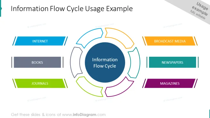
Die PowerPoint-Folie beschreibt ein Konzept namens "Informationsflusszyklus", dargestellt durch ein zentrales kreisförmiges Diagramm, das von beschrifteten Segmenten umgeben ist. Jedes Segment stellt eine Informationsquelle dar: Internet (mit zwei blauen Linien hervorgehoben), Bücher (in Dunkelgrau), Fachzeitschriften (in Grün), Rundfunkmedien (mit zwei orangefarbenen Linien), Zeitungen (in Blaugrün) und Magazine (in Lila). Das Internet bedeutet Online-Quellen, Bücher deuten auf traditionelle Literatur hin, Fachzeitschriften bezeichnen wissenschaftliche Artikel, Rundfunkmedien stehen für Fernsehen und Radio, Zeitungen zeigen täglich geschriebene Nachrichten an, und Magazine implizieren periodische Veröffentlichungen.


