Your graphics add a nice touch to my presentations and I recently used them for one of my all-hands meetings. Your toolbox adds professionalism to my slides. Instead of using standard clipart.
Claude Jones, Director of Engineer, @Walmartlabs, USA
Your graphics add a nice touch to my presentations and I recently used them for one of my all-hands meetings. Your toolbox adds professionalism to my slides. Instead of using standard clipart.
Claude Jones, Director of Engineer, @Walmartlabs, USA
I needed a fresh look at some of my slides. I've tried to find a way to create a paintbrush effect, to underline, accentuate, add some color and the handwritten markers were just the things. Very easy to use, easy to size, change the color. It was an affordable, perfect solution and I'm happy to recommend it.
Anonymous, US
The crisp, clean look of the graphics, and the fact that it allowed me to easily edit and change the colors to match the template was my main reason for purchasing them.
Brandie Jenkins, E-learning Developer, USA
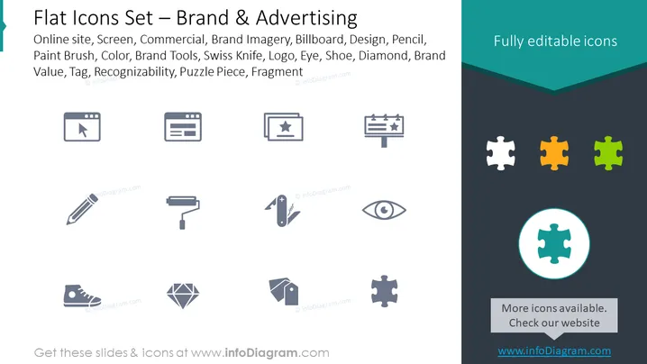
Die Folie bietet eine Sammlung von Graustufen-Icons, die mit Branding- und Werbethemen in Verbindung stehen. Diese Icons umfassen Darstellungen einer "Online-Seite," dargestellt als Webbrowser mit einem Cursor, "Bildschirm," der verschiedene Displaytypen repräsentieren könnte, "Werbung," dargestellt als Klappe, was auf Videoproduktion hinweist, "Markenbilder," symbolisiert durch ein Plakat, "Design," dargestellt als Bleistiftzeichnungssymbol, "Pinsel," "Farbe" dargestellt mit Farbmuster, "Markenwerkzeuge," illustriert durch ein Schweizer Taschenmesser, was Vielseitigkeit suggeriert, "Logo," symbolisiert durch ein Auge, das auf visuelle Identität hinweist, "Schuh," möglicherweise für Mode oder Einzelhandel, "Diamant," der Luxus oder Wert repräsentiert, "Markenwert," mit einem Etikonsymbol, "Wiedererkennung," angezeigt durch ein Puzzlestück, und "Fragment," das ein weiteres Puzzlestück mit einer anderen Form ist.
Die Folie weist ein sauberes und professionelles Layout mit einem modernen Design auf, das die Icons betont. Die Farbgestaltung ist minimalistisch und konzentriert sich auf den Kontrast zwischen graustufigen Icons und einem dunklen Hintergrund, was ihre Einfachheit und Klarheit hervorhebt.


