

Your graphics add a nice touch to my presentations and I recently used them for one of my all-hands meetings. Your toolbox adds professionalism to my slides. Instead of using standard clipart.
Claude Jones, Director of Engineer, @Walmartlabs, USA

Your graphics add a nice touch to my presentations and I recently used them for one of my all-hands meetings. Your toolbox adds professionalism to my slides. Instead of using standard clipart.
Claude Jones, Director of Engineer, @Walmartlabs, USA
I needed a fresh look at some of my slides. I've tried to find a way to create a paintbrush effect, to underline, accentuate, add some color and the handwritten markers were just the things. Very easy to use, easy to size, change the color. It was an affordable, perfect solution and I'm happy to recommend it.
Anonymous, US
The crisp, clean look of the graphics, and the fact that it allowed me to easily edit and change the colors to match the template was my main reason for purchasing them.
Brandie Jenkins, E-learning Developer, USA
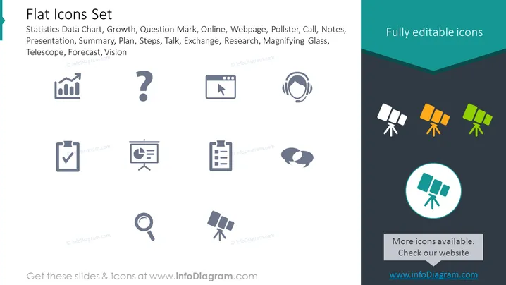
Die Folie präsentiert eine Sammlung flacher Icons, die verschiedene Geschäfts- und Forschungskonzepte darstellen. Diese Icons umfassen ein Balkendiagramm für "Statistikdaten-Diagramm", was auf Datenanalyse oder Berichterstattung hindeutet; ein Fragezeichen für "Fragezeichen", das für Anfrage oder Problemlösung steht; einen Cursor, der einen Button klickt, für "Online", der Internetaktivitäten oder digitale Präsenz anzeigt; einen Kopf mit Schallwellen für "Anruf", der Kommunikation oder Kundenservice repräsentiert; eine Checkliste für "Präsentation", was auf Planung oder Zusammenfassung hindeutet; ein Präsentationsboard für "Webseite", das Content-Sharing oder Bildung widerspiegelt; ein Notiznahmen-Icon für "Meinungsforschungsinstitut", das auf Umfragen oder Feedbacksammlung hinweist; ein Clipboard für "Notizen", das mit Dokumentation oder Informationsmanagement assoziiert wird; eine Sprechblase für "Gespräch", die Dialog oder Diskussionen symbolisiert; und eine Lupe für "Forschung", die Untersuchung oder detailliertes Studium betont. Jedes Icon ist mit einem Schlüsselwort kombiniert, das die mögliche Nutzung oder Bedeutung in verschiedenen Kontexten vermitteln soll.
Das Folienlayout ist sauber und modern, mit einem minimalistischen Ansatz zur Ikonografie, der ein schnelles Verständnis erleichtert. Der Kontrast zwischen den hellgrauen Icons und dem dunklen Hintergrund lässt die Icons deutlich hervorstechen.



