Your graphics add a nice touch to my presentations and I recently used them for one of my all-hands meetings. Your toolbox adds professionalism to my slides. Instead of using standard clipart.
Claude Jones, Director of Engineer, @Walmartlabs, USA
Your graphics add a nice touch to my presentations and I recently used them for one of my all-hands meetings. Your toolbox adds professionalism to my slides. Instead of using standard clipart.
Claude Jones, Director of Engineer, @Walmartlabs, USA
I needed a fresh look at some of my slides. I've tried to find a way to create a paintbrush effect, to underline, accentuate, add some color and the handwritten markers were just the things. Very easy to use, easy to size, change the color. It was an affordable, perfect solution and I'm happy to recommend it.
Anonymous, US
The crisp, clean look of the graphics, and the fact that it allowed me to easily edit and change the colors to match the template was my main reason for purchasing them.
Brandie Jenkins, E-learning Developer, USA
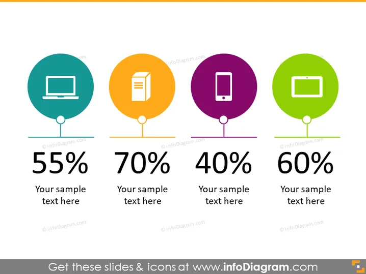
Die PowerPoint-Folie präsentiert eine vergleichende Analyse von vier verschiedenen Datenpunkten. Jeder Datenpunkt kombiniert einen numerischen Prozentsatz mit einem Platzhalter für Beispieltext, um den Kontext bereitzustellen, der vermutlich die Bedeutung des Prozentsatzes erklärt. Die vier angezeigten Prozentsätze sind 55 %, 70 %, 40 % und 60 %, wobei jeder mit einem repräsentativen Symbol kombiniert ist, das unterschiedliche Kategorien oder Schwerpunktbereiche andeutet—wie z. B. Technologieplattformen, Inhaltsarten oder Benutzerengagementsbewertungen—und vermutlich als visuelle Unterstützung zur schnellen Erkennung und zum Verständnis jedes Datenpunkts dienen soll.
Das gesamte Aussehen der Folie ist sauber, modern und farbenfroh, wobei die Symbole und Prozentsätze Aufmerksamkeit erregen. Der konsistente Stil und die Symmetrie schaffen eine leicht verdauliche visuelle Hierarchie, die die Daten betont.


