Your graphics add a nice touch to my presentations and I recently used them for one of my all-hands meetings. Your toolbox adds professionalism to my slides. Instead of using standard clipart.
Claude Jones, Director of Engineer, @Walmartlabs, USA
Your graphics add a nice touch to my presentations and I recently used them for one of my all-hands meetings. Your toolbox adds professionalism to my slides. Instead of using standard clipart.
Claude Jones, Director of Engineer, @Walmartlabs, USA
I needed a fresh look at some of my slides. I've tried to find a way to create a paintbrush effect, to underline, accentuate, add some color and the handwritten markers were just the things. Very easy to use, easy to size, change the color. It was an affordable, perfect solution and I'm happy to recommend it.
Anonymous, US
The crisp, clean look of the graphics, and the fact that it allowed me to easily edit and change the colors to match the template was my main reason for purchasing them.
Brandie Jenkins, E-learning Developer, USA
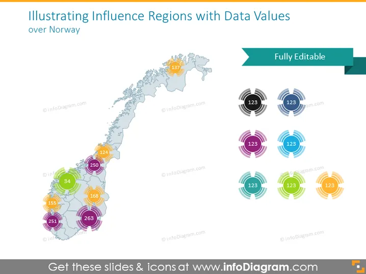
Die Folie präsentiert ein geografisches Datenvisualisierungskonzept, das die Karte Norwegens nutzt, um zu demonstrieren, wie verschiedene Regionen von bestimmten Datenwerten beeinflusst werden. Jede Region auf der Karte ist mit einem lebhaft gefärbten, halbtransparenten Fleck markiert, wobei entsprechende Zahlen spezifische Datenpunkte anzeigen. Die farbcodierten Flecken stehen für verschiedene Einflussregionen und repräsentieren wahrscheinlich unterschiedliche Datensätze oder Kennzahlen, wie Bevölkerungszahlen, Verkaufsvolumen oder andere regionsspezifische Statistiken, die einen visuellen Vergleich im ganzen Land ermöglichen.
Die Folie hat ein sauberes und modernes Aussehen, mit einem Schwerpunkt auf Farbcode, um zwischen Datensätzen zu unterscheiden. Visuelle Elemente sind angeordnet, um Balance zu schaffen, mit grafischen Datenrepräsentationen auf der linken Seite und einer Legende oder einem Schlüssel auf der rechten Seite.


