

Your graphics add a nice touch to my presentations and I recently used them for one of my all-hands meetings. Your toolbox adds professionalism to my slides. Instead of using standard clipart.
Claude Jones, Director of Engineer, @Walmartlabs, USA

Your graphics add a nice touch to my presentations and I recently used them for one of my all-hands meetings. Your toolbox adds professionalism to my slides. Instead of using standard clipart.
Claude Jones, Director of Engineer, @Walmartlabs, USA
I needed a fresh look at some of my slides. I've tried to find a way to create a paintbrush effect, to underline, accentuate, add some color and the handwritten markers were just the things. Very easy to use, easy to size, change the color. It was an affordable, perfect solution and I'm happy to recommend it.
Anonymous, US
The crisp, clean look of the graphics, and the fact that it allowed me to easily edit and change the colors to match the template was my main reason for purchasing them.
Brandie Jenkins, E-learning Developer, USA
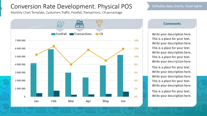
Die Folie zeigt ein Diagramm, das die Conversion-Raten im Kontext eines physischen Verkaufsortes verfolgt. Es enthält:
Die Daten werden über sechs Monate dargestellt, wobei die Trends in jeder Kategorie angezeigt werden, um zu veranschaulichen, wie der Fußverkehr mit den Verkaufs- und Conversion-Prozentzahlen korreliert.
Diagrammbereich: Enthält ein Balkendiagramm, das den Fußverkehr darstellt, und ein Liniendiagramm für die Conversion-Rate, gegliedert nach Monaten von Januar bis Juni.
Symbole: Drei Symbole repräsentieren Fußverkehr, Transaktionen und Conversion-Rate, die jeweils die entsprechenden Konzepte visuell darstellen.
Farbkodierung: Balken sind türkis für Fußverkehr, ein dunklerer Farbton für Transaktionen, und Linien sind orange für die Conversion-Rate.
Layout: Ein Kommentarfeld nimmt die rechte Seite ein und bietet Platz für detaillierte Anmerkungen.
Hintergrund: Heller, professioneller Hintergrund mit einem Hauch von thematischen Designelementen zur Verbesserung der Lesbarkeit.
Die Folie balanciert quantitative Datenvisualisierung mit textlichen Erklärungen und macht komplexe Informationen zugänglich und visuell ansprechend.



