

Your graphics add a nice touch to my presentations and I recently used them for one of my all-hands meetings. Your toolbox adds professionalism to my slides. Instead of using standard clipart.
Claude Jones, Director of Engineer, @Walmartlabs, USA

Your graphics add a nice touch to my presentations and I recently used them for one of my all-hands meetings. Your toolbox adds professionalism to my slides. Instead of using standard clipart.
Claude Jones, Director of Engineer, @Walmartlabs, USA
I needed a fresh look at some of my slides. I've tried to find a way to create a paintbrush effect, to underline, accentuate, add some color and the handwritten markers were just the things. Very easy to use, easy to size, change the color. It was an affordable, perfect solution and I'm happy to recommend it.
Anonymous, US
The crisp, clean look of the graphics, and the fact that it allowed me to easily edit and change the colors to match the template was my main reason for purchasing them.
Brandie Jenkins, E-learning Developer, USA
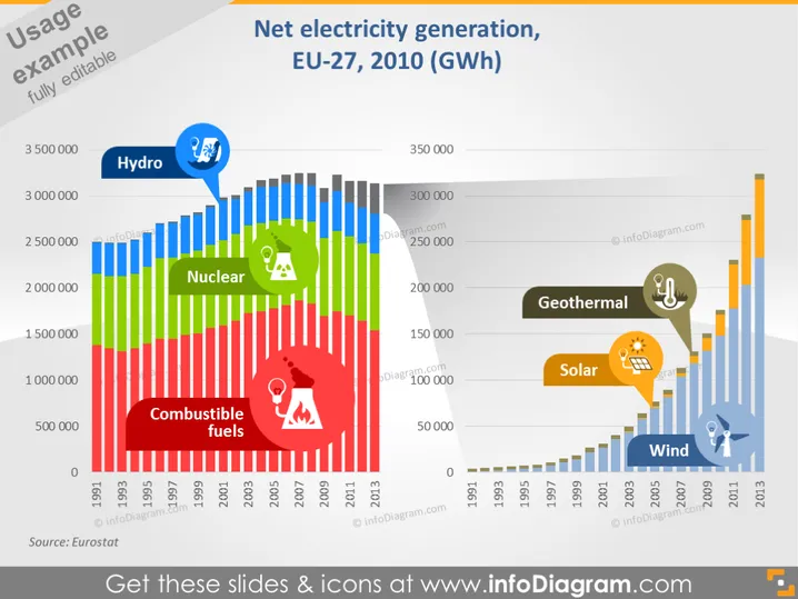
Die Folie präsentiert Daten zur Nettostromerzeugung der EU-27 im Jahr 2010, gemessen in Gigawattstunden. Das Balkendiagramm zeigt verschiedene Energiequellen wie Wasser, Kernenergie, fossile Brennstoffe, Geothermie, Solarenergie und Windenergie. Wasser, dargestellt in Blau, weist herausragende Erzeugungszahlen auf, während Kernenergie in atomar-grün und fossile Brennstoffe in Rot ebenfalls signifikante Beiträge zeigen. Erneuerbare Energien wie Geothermie, Solar und Wind sind mit kleineren, aber wirkungsvollen Datenpunkten illustriert, was auf die Vielfalt im Energiemix der EU hinweist.
Die Folie ist ordentlich organisiert mit einer starken visuellen Hierarchie, die bei der Interpretation komplexer Daten hilft. Die Farbgebung und die Symbole werden effektiv genutzt, um eine sofortige Erkennung der verschiedenen Energiequellen zu ermöglichen.



