

Your graphics add a nice touch to my presentations and I recently used them for one of my all-hands meetings. Your toolbox adds professionalism to my slides. Instead of using standard clipart.
Claude Jones, Director of Engineer, @Walmartlabs, USA

Your graphics add a nice touch to my presentations and I recently used them for one of my all-hands meetings. Your toolbox adds professionalism to my slides. Instead of using standard clipart.
Claude Jones, Director of Engineer, @Walmartlabs, USA
I needed a fresh look at some of my slides. I've tried to find a way to create a paintbrush effect, to underline, accentuate, add some color and the handwritten markers were just the things. Very easy to use, easy to size, change the color. It was an affordable, perfect solution and I'm happy to recommend it.
Anonymous, US
The crisp, clean look of the graphics, and the fact that it allowed me to easily edit and change the colors to match the template was my main reason for purchasing them.
Brandie Jenkins, E-learning Developer, USA
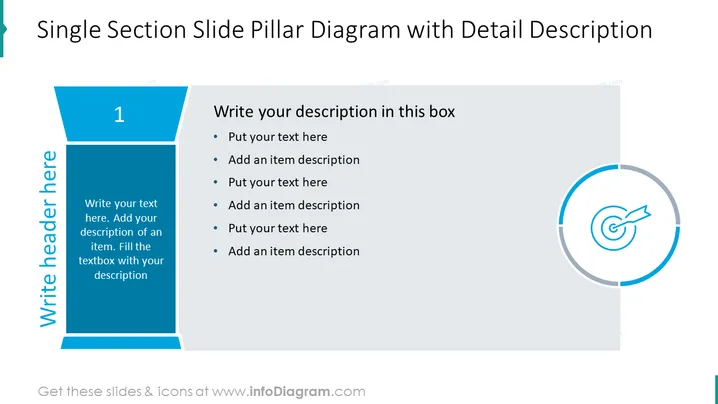
Die Folie ist so gestaltet, dass sie einen einzelnen Abschnitt oder eine Idee mit einer detaillierten Beschreibung und Aufzählungspunkten präsentiert. Das Säulendiagramm dient als visuelle Darstellung einer Hauptkategorie, die mit "1" gekennzeichnet ist, was darauf hindeutet, dass die Folie Teil einer Sequenz sein könnte. Der begleitende Textbereich fordert eine detaillierte Beschreibung des Themas an. Jeder Aufzählungspunkt sollte spezifische Details oder Unterpunkte enthalten, die mit der Hauptkategorie zusammenhängen, um komplexe Informationen in verdauliche Teile für das Publikum aufzuschlüsseln.
Das Gesamtbild der Folie ist professionell und sauber, mit einem ausgewogenen Einsatz von Farbe und Raum, das für eine Geschäftspräsentation geeignet wäre. Die deutliche Trennung zwischen der Grafik und den Textbereichen ermöglicht eine klare Unterscheidung zwischen dem Hauptpunkt und seinen Erläuterungen.



