
Your graphics add a nice touch to my presentations and I recently used them for one of my all-hands meetings. Your toolbox adds professionalism to my slides. Instead of using standard clipart.
Claude Jones, Director of Engineer, @Walmartlabs, USA

Your graphics add a nice touch to my presentations and I recently used them for one of my all-hands meetings. Your toolbox adds professionalism to my slides. Instead of using standard clipart.
Claude Jones, Director of Engineer, @Walmartlabs, USA

I needed a fresh look at some of my slides. I've tried to find a way to create a paintbrush effect, to underline, accentuate, add some color and the handwritten markers were just the things. Very easy to use, easy to size, change the color. It was an affordable, perfect solution and I'm happy to recommend it.
Anonymous, US
The crisp, clean look of the graphics, and the fact that it allowed me to easily edit and change the colors to match the template was my main reason for purchasing them.
Brandie Jenkins, E-learning Developer, USA
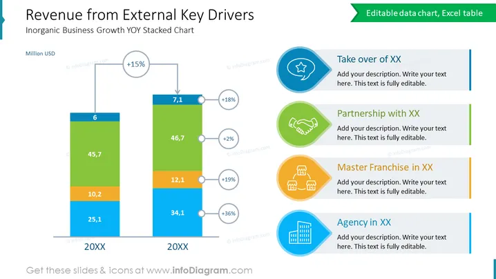
Die Folie präsentiert ein Diagramm "Einnahmen aus externen Schlüsselfaktoren", das das anorganische Geschäftswachstum im Jahresvergleich (YOY) mithilfe eines gestapelten Säulendiagramms detailliert darstellt. Das Diagramm zeigt das numerische Wachstum für ein jeweiliges Jahr, das als "20XX" gekennzeichnet ist, und prozentuale Zunahmen zwischen den Säulen. Diese werden von Erklärungen zu verschiedenen Wachstumsansätzen begleitet, wie "Übernahme von XX", "Partnerschaft mit XX", "Master Franchise in XX" und "Agentur in XX", die wahrscheinlich unterschiedliche Strategien oder Ereignisse beschreiben sollen, die zu Umsatzsteigerungen geführt haben.
Das Gesamtbild der Folie ist klar und professionell, mit einer starken visuellen Hierarchie, die den Betrachter vom Datendiagramm zu den beschreibenden Elementen leitet. Die Verwendung von Farben ist konsistent und hilft dabei, Informationen visuell zu kategorisieren.


