

Your graphics add a nice touch to my presentations and I recently used them for one of my all-hands meetings. Your toolbox adds professionalism to my slides. Instead of using standard clipart.
Claude Jones, Director of Engineer, @Walmartlabs, USA

Your graphics add a nice touch to my presentations and I recently used them for one of my all-hands meetings. Your toolbox adds professionalism to my slides. Instead of using standard clipart.
Claude Jones, Director of Engineer, @Walmartlabs, USA
I needed a fresh look at some of my slides. I've tried to find a way to create a paintbrush effect, to underline, accentuate, add some color and the handwritten markers were just the things. Very easy to use, easy to size, change the color. It was an affordable, perfect solution and I'm happy to recommend it.
Anonymous, US
The crisp, clean look of the graphics, and the fact that it allowed me to easily edit and change the colors to match the template was my main reason for purchasing them.
Brandie Jenkins, E-learning Developer, USA
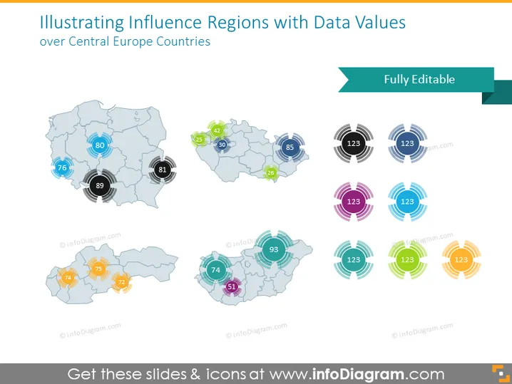
Diese PowerPoint-Folie scheint Datenwerte zu präsentieren, die Einfluss oder Kennzahlen über Regionen in Mitteleuropa anzeigen. Es gibt mehrere Grafiksätze, die jeweils verschiedene Länder oder Regionen darstellen, mit kreisförmigen Symbolen, die sich über die Karten legen, um numerische Werte darzustellen. Jeder numerische Wert scheint bedeutend zu sein, um das Niveau des Einflusses oder eine bestimmte quantitative Maßnahme zu erklären, die für diese spezifische Region relevant sein könnte, und könnte Daten wie Bevölkerung, wirtschaftliche Leistung oder ähnliche Kennzahlen repräsentieren.
Die Folie hat einen professionellen und modernen visuellen Stil, der auf Klarheit und Leichtigkeit der Datenpräsentation ausgerichtet ist. Der Einsatz von Farben ist strategisch, um zwischen verschiedenen Datenpunkten oder Regionen zu differenzieren.



