Your graphics add a nice touch to my presentations and I recently used them for one of my all-hands meetings. Your toolbox adds professionalism to my slides. Instead of using standard clipart.
Claude Jones, Director of Engineer, @Walmartlabs, USA
Your graphics add a nice touch to my presentations and I recently used them for one of my all-hands meetings. Your toolbox adds professionalism to my slides. Instead of using standard clipart.
Claude Jones, Director of Engineer, @Walmartlabs, USA
I needed a fresh look at some of my slides. I've tried to find a way to create a paintbrush effect, to underline, accentuate, add some color and the handwritten markers were just the things. Very easy to use, easy to size, change the color. It was an affordable, perfect solution and I'm happy to recommend it.
Anonymous, US
The crisp, clean look of the graphics, and the fact that it allowed me to easily edit and change the colors to match the template was my main reason for purchasing them.
Brandie Jenkins, E-learning Developer, USA
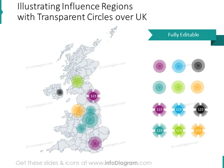
Die PowerPoint-Folie scheint ein visuelles Werkzeug zu sein, um verschiedene Einflussbereiche auf einer Karte des Vereinigten Königreichs mithilfe von transparenten, farbigen Kreisen mit numerischen Beschriftungen darzustellen. Jeder Kreis könnte eine andere Region oder einen Einflussbereich repräsentieren, wobei die Transparenz möglicherweise die Stärke oder Intensität des Einflusses andeutet. Größere Zahlen in einigen Kreisen implizieren eine Rangfolge oder quantitative Bewertung der Bedeutung oder Auswirkung jeder Region.
Das Gesamterscheinungsbild der Folie ist professionell und sauber, mit einem ausgewogenen Einsatz von Farbe und Raum. Die transparenten Kreise mit Zahlen bieten eine leicht verständliche visuelle Darstellung von Daten.


