Your graphics add a nice touch to my presentations and I recently used them for one of my all-hands meetings. Your toolbox adds professionalism to my slides. Instead of using standard clipart.
Claude Jones, Director of Engineer, @Walmartlabs, USA
Your graphics add a nice touch to my presentations and I recently used them for one of my all-hands meetings. Your toolbox adds professionalism to my slides. Instead of using standard clipart.
Claude Jones, Director of Engineer, @Walmartlabs, USA
I needed a fresh look at some of my slides. I've tried to find a way to create a paintbrush effect, to underline, accentuate, add some color and the handwritten markers were just the things. Very easy to use, easy to size, change the color. It was an affordable, perfect solution and I'm happy to recommend it.
Anonymous, US
The crisp, clean look of the graphics, and the fact that it allowed me to easily edit and change the colors to match the template was my main reason for purchasing them.
Brandie Jenkins, E-learning Developer, USA
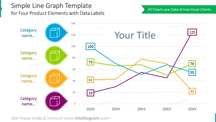
Die Folie ist eine visuelle Darstellung, die ein Liniendiagramm für vier verschiedene Kategorien zeigt, jede mit einer einzigartigen Farbe und Datenbeschriftungen, die bestimmte Werte zu verschiedenen Zeitpunkten anzeigen. Diese Punkte erfassen wahrscheinlich eine Art Leistungskennzahl oder ähnliche Daten über drei Zeitperioden, die als "20XX" bezeichnet werden. Die Trajektorie jeder Kategorie kann analysiert werden, um Trends, Leistungen zu bestimmen oder um sie mit den anderen Kategorien zu vergleichen. Die Folie scheint für die Präsentation quantitativer Vergleiche in klarer und prägnanter Weise entworfen worden zu sein.


