Your graphics add a nice touch to my presentations and I recently used them for one of my all-hands meetings. Your toolbox adds professionalism to my slides. Instead of using standard clipart.
Claude Jones, Director of Engineer, @Walmartlabs, USA
Your graphics add a nice touch to my presentations and I recently used them for one of my all-hands meetings. Your toolbox adds professionalism to my slides. Instead of using standard clipart.
Claude Jones, Director of Engineer, @Walmartlabs, USA
I needed a fresh look at some of my slides. I've tried to find a way to create a paintbrush effect, to underline, accentuate, add some color and the handwritten markers were just the things. Very easy to use, easy to size, change the color. It was an affordable, perfect solution and I'm happy to recommend it.
Anonymous, US
The crisp, clean look of the graphics, and the fact that it allowed me to easily edit and change the colors to match the template was my main reason for purchasing them.
Brandie Jenkins, E-learning Developer, USA
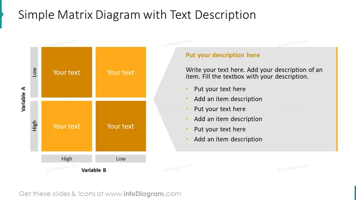
Die Folie präsentiert ein einfaches Matrixdiagramm, das verwendet wird, um Beziehungen zwischen zwei Variablen zu analysieren, die als Variable A und Variable B bezeichnet werden, jeweils mit einer Dichotomie von hoch und niedrig. Die Matrix ist in vier Quadranten unterteilt, die unterschiedliche Kombinationen dieser Variablen anzeigen (z. B. hohe Variable A mit niedriger Variable B usw.), mit Platzhaltern für Text in jedem Quadranten, um spezifische Szenarien oder Merkmale zu beschreiben. Es gibt einen zusätzlichen Abschnitt auf der rechten Seite für eine detaillierte Beschreibung, die Aufzählungspunkte enthält, um die in der Matrix aufgelisteten Punkte zu ergänzen.
Die Folie hat ein sauberes, modernes Aussehen mit einem Farbschema, das auf Orangetönen basiert und sich von einem hellen Hintergrund abhebt. Das einfache Design fördert Klarheit und Fokus auf den Inhalt.


