Your graphics add a nice touch to my presentations and I recently used them for one of my all-hands meetings. Your toolbox adds professionalism to my slides. Instead of using standard clipart.
Claude Jones, Director of Engineer, @Walmartlabs, USA
Your graphics add a nice touch to my presentations and I recently used them for one of my all-hands meetings. Your toolbox adds professionalism to my slides. Instead of using standard clipart.
Claude Jones, Director of Engineer, @Walmartlabs, USA
I needed a fresh look at some of my slides. I've tried to find a way to create a paintbrush effect, to underline, accentuate, add some color and the handwritten markers were just the things. Very easy to use, easy to size, change the color. It was an affordable, perfect solution and I'm happy to recommend it.
Anonymous, US
The crisp, clean look of the graphics, and the fact that it allowed me to easily edit and change the colors to match the template was my main reason for purchasing them.
Brandie Jenkins, E-learning Developer, USA
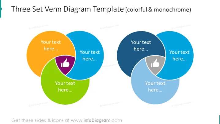
Die PowerPoint-Folie zeigt eine Drei-Satz-Venn-Diagramm-Vorlage sowohl in bunten als auch in monochromen Versionen. Venn-Diagramme werden verwendet, um logische Beziehungen zwischen verschiedenen Mengen von Elementen oder Datenpunkten darzustellen. Dieses Diagramm hat überlappende Kreise, die jeweils mit "Ihr Text hier..." beschriftet sind, und zeigen Platzhalter für den Inhalt des Benutzers an. Die überlappenden Bereiche, in denen die Kreise sich schneiden, deuten auf gemeinsame Merkmale oder Datenpunkte zwischen den Mengen hin. Das Diagramm enthält ein Symbol mit einem Daumen nach oben in der Mitte, das einen Bereich des Einvernehmens oder einer positiven Schnittmenge darstellt.
Die Folie verwendet ein sauberes und professionelles Design mit dem Einsatz von Transparenz, um die Schnittmengen der Mengen klar darzustellen. Die kontrastierenden bunten und monochromen Diagramme bieten visuelles Interesse und Optionen für Präsentierende.


