
Your graphics add a nice touch to my presentations and I recently used them for one of my all-hands meetings. Your toolbox adds professionalism to my slides. Instead of using standard clipart.
Claude Jones, Director of Engineer, @Walmartlabs, USA
Your graphics add a nice touch to my presentations and I recently used them for one of my all-hands meetings. Your toolbox adds professionalism to my slides. Instead of using standard clipart.
Claude Jones, Director of Engineer, @Walmartlabs, USA
I needed a fresh look at some of my slides. I've tried to find a way to create a paintbrush effect, to underline, accentuate, add some color and the handwritten markers were just the things. Very easy to use, easy to size, change the color. It was an affordable, perfect solution and I'm happy to recommend it.
Anonymous, US
The crisp, clean look of the graphics, and the fact that it allowed me to easily edit and change the colors to match the template was my main reason for purchasing them.
Brandie Jenkins, E-learning Developer, USA
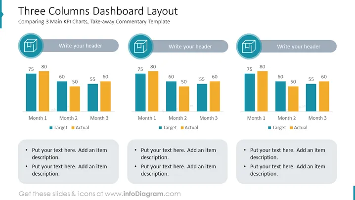
Die PowerPoint-Folie mit dem Titel "Dreispaltiges Dashboard-Layout" vergleicht drei Schlüssel Leistungsindikatoren (KPI) über einen Zeitraum von drei Monaten. Jede Spalte steht für einen anderen KPI, wobei Balkendiagramme 'Ziel' und 'Tatsächlich' Werte anzeigen. Die Folie ist so strukturiert, dass ein Header und Kommentare neben jedem Diagramm platziert werden können. Zudem gibt es am Ende jeder Spalte Aufzählungspunkte, wo zusätzlicher beschreibender Text hinzugefügt werden kann. Dieses Layout ist so gestaltet, dass es einen klaren visuellen Vergleich ermöglicht und einprägsame Kommentare für jeden KPI erleichtert.
Die Folie hat ein sauberes und professionelles visuelles Design, das ein Farbschema verwendet, das gut kontrastiert, um zwischen den Elementen zu differenzieren. Der Einsatz von Symbolen, Diagrammen und Aufzählungspunkten bietet einen organisierten Ansatz zur Präsentation von Daten und zugehörigen Kommentaren.




