
Your graphics add a nice touch to my presentations and I recently used them for one of my all-hands meetings. Your toolbox adds professionalism to my slides. Instead of using standard clipart.
Claude Jones, Director of Engineer, @Walmartlabs, USA
Your graphics add a nice touch to my presentations and I recently used them for one of my all-hands meetings. Your toolbox adds professionalism to my slides. Instead of using standard clipart.
Claude Jones, Director of Engineer, @Walmartlabs, USA
I needed a fresh look at some of my slides. I've tried to find a way to create a paintbrush effect, to underline, accentuate, add some color and the handwritten markers were just the things. Very easy to use, easy to size, change the color. It was an affordable, perfect solution and I'm happy to recommend it.
Anonymous, US
The crisp, clean look of the graphics, and the fact that it allowed me to easily edit and change the colors to match the template was my main reason for purchasing them.
Brandie Jenkins, E-learning Developer, USA
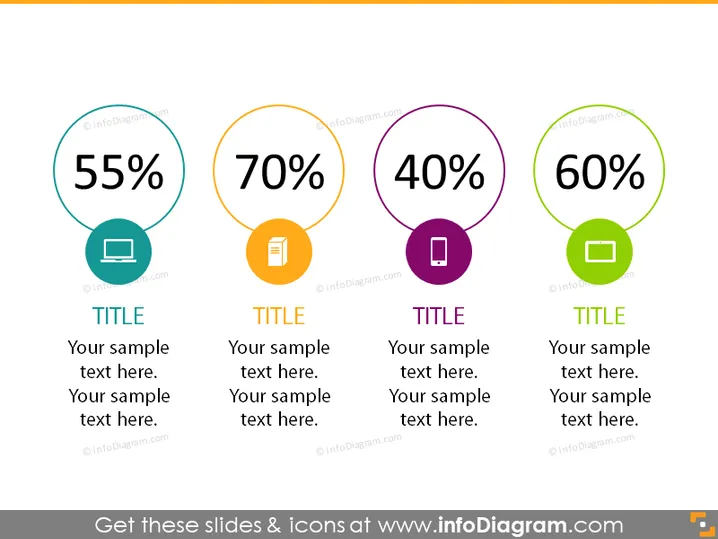
Die PowerPoint-Folie zeigt vier verschiedene kreisförmige grafische Elemente, die jeweils einen einzigartigen Prozentwert darstellen und mit einem bestimmten Icon und einer bestimmten Farbe versehen sind. Die angezeigten Prozentsätze sind 55%, 70%, 40% und 60%, jeweils in einem eigenen Kreis. Diese sind wahrscheinlich indikativ für Kennzahlen wie Leistung, Abschluss, Zufriedenheit oder andere messbare Daten. Unter jedem Kreis befindet sich ein Platzhalter für einen Titel und zusätzlichen Beispieltext, was darauf hindeutet, dass jede Kennzahl weiter erklärt oder kontextualisiert werden kann.




