
Your graphics add a nice touch to my presentations and I recently used them for one of my all-hands meetings. Your toolbox adds professionalism to my slides. Instead of using standard clipart.
Claude Jones, Director of Engineer, @Walmartlabs, USA
Your graphics add a nice touch to my presentations and I recently used them for one of my all-hands meetings. Your toolbox adds professionalism to my slides. Instead of using standard clipart.
Claude Jones, Director of Engineer, @Walmartlabs, USA
I needed a fresh look at some of my slides. I've tried to find a way to create a paintbrush effect, to underline, accentuate, add some color and the handwritten markers were just the things. Very easy to use, easy to size, change the color. It was an affordable, perfect solution and I'm happy to recommend it.
Anonymous, US
The crisp, clean look of the graphics, and the fact that it allowed me to easily edit and change the colors to match the template was my main reason for purchasing them.
Brandie Jenkins, E-learning Developer, USA
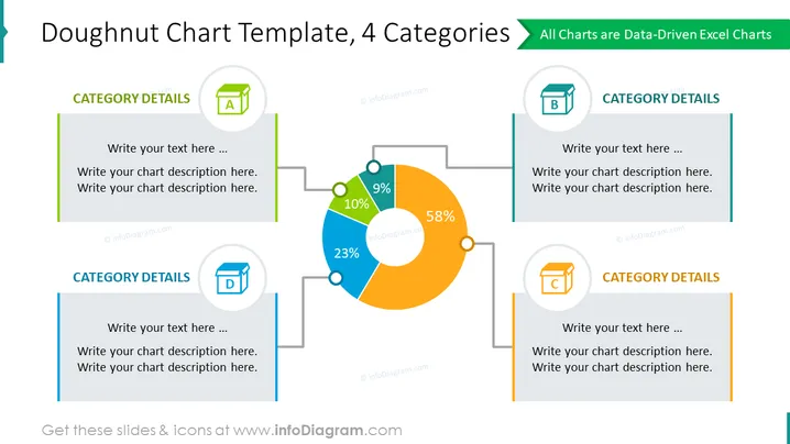
Diese PowerPoint-Folie präsentiert eine Doughnut-Diagrammvorschau mit vier Kategorien, die mit A, B, C und D gekennzeichnet sind und zur Darstellung von Daten in proportionalen Segmenten gedacht ist. Das Diagramm wird durch vier Textfelder mit Symbolen für jede Kategorie ergänzt, die Plätze vorschlagen, um Beschreibungen für jedes Segment zu schreiben. Prozentsätze werden innerhalb der Diagrammscheiben angezeigt und zeigen ihren Anteil am Gesamtwert an - wobei die visuelle Prominenz einen Fokus auf die Datenaufgliederung und den vergleichenden Analyse legt. Die Textplatzhalter ermutigen zu Anpassungen und einer detaillierten Erklärung der im Diagramm dargestellten Daten.
Der Gesamteindruck der Folie ist professionell und visuell ausgewogen, mit dem Fokus auf dem zentralen Doughnut-Diagramm. Die Farbcodierung der Textfelder, um mit den Diagrammsegmenten übereinzustimmen, erleichtert eine schnelle visuelle Assoziation und ein kohärentes Design.




