Your graphics add a nice touch to my presentations and I recently used them for one of my all-hands meetings. Your toolbox adds professionalism to my slides. Instead of using standard clipart.
Claude Jones, Director of Engineer, @Walmartlabs, USA
Your graphics add a nice touch to my presentations and I recently used them for one of my all-hands meetings. Your toolbox adds professionalism to my slides. Instead of using standard clipart.
Claude Jones, Director of Engineer, @Walmartlabs, USA
I needed a fresh look at some of my slides. I've tried to find a way to create a paintbrush effect, to underline, accentuate, add some color and the handwritten markers were just the things. Very easy to use, easy to size, change the color. It was an affordable, perfect solution and I'm happy to recommend it.
Anonymous, US
The crisp, clean look of the graphics, and the fact that it allowed me to easily edit and change the colors to match the template was my main reason for purchasing them.
Brandie Jenkins, E-learning Developer, USA
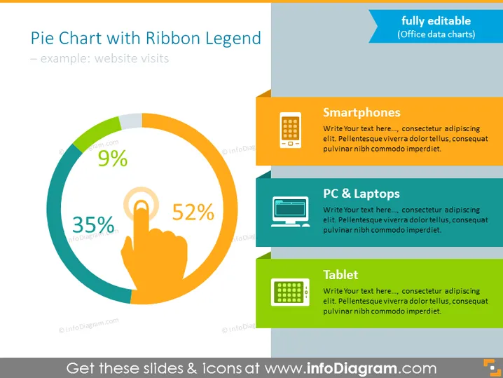
Die Folie zeigt ein Kreisdiagramm, das Statistiken über Website-Besuche veranschaulicht, dargestellt durch drei Geräte: Smartphones (52%), PC & Laptops (35%) und Tablets (9%). Jede Kategorie ist farblich kodiert und mit einem Symbol versehen, das den Typ des jeweiligen Geräts veranschaulicht. Der Segment "Smartphones" zeigt den größten Teil der Website-Besuche, was die Verbreitung des mobilen Surfens nahelegt. Der Abschnitt "PC & Laptops" repräsentiert einen erheblichen, jedoch kleineren Teil der Besuche, während "Tablet" den geringsten Anteil zeigt, was darauf hinweist, dass es in diesem Beispiel das am wenigsten genutzte Gerät zum Zugriff auf die Website ist.
Die Folie hat ein sauberes, modernes Aussehen mit hellen, kontrastierenden Farben, die die Informationen hervorheben. Die visuellen Elemente sind gut organisiert, was ein leichtes Verständnis der präsentierten Daten ermöglicht.


