Your graphics add a nice touch to my presentations and I recently used them for one of my all-hands meetings. Your toolbox adds professionalism to my slides. Instead of using standard clipart.
Claude Jones, Director of Engineer, @Walmartlabs, USA
Your graphics add a nice touch to my presentations and I recently used them for one of my all-hands meetings. Your toolbox adds professionalism to my slides. Instead of using standard clipart.
Claude Jones, Director of Engineer, @Walmartlabs, USA
I needed a fresh look at some of my slides. I've tried to find a way to create a paintbrush effect, to underline, accentuate, add some color and the handwritten markers were just the things. Very easy to use, easy to size, change the color. It was an affordable, perfect solution and I'm happy to recommend it.
Anonymous, US
The crisp, clean look of the graphics, and the fact that it allowed me to easily edit and change the colors to match the template was my main reason for purchasing them.
Brandie Jenkins, E-learning Developer, USA
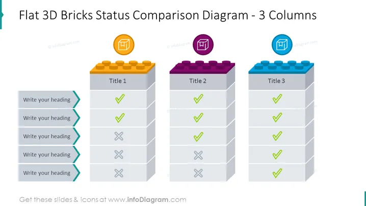
Die Folie präsentiert ein Statusvergleichsdiagramm mit drei Spalten, die jeweils einem Stapel flacher 3D-Ziegel ähneln. Die erste Spalte mit dem Titel "Titel 1" zeigt positiven Status mit grünen Häkchen und negativen Status mit roten "X"-Marken, was auf eine Mischung aus erfolgreichen und erfolglosen Elementen hinweist. Die zweite Spalte, "Titel 2", zeigt ein ähnliches Muster, jedoch mit weniger negativen Markierungen, was auf eine bessere Leistung hindeutet. Die dritte Spalte, "Titel 3", zeigt nur grüne Häkchen, was anzeigt, dass alle Elemente in einem günstigen Zustand sind oder ihre Ziele erreicht haben.
Die Gesamtoptik ist modern und minimalistisch, mit lebendigen Farben, die strategisch eingesetzt werden, um wichtige Vergleichspunkte hervorzuheben. Die Verwendung vertrauter Symbole wie Häkchen und "X"-Marken hilft, den Status der verschiedenen Elemente schnell zu vermitteln.


