

Your graphics add a nice touch to my presentations and I recently used them for one of my all-hands meetings. Your toolbox adds professionalism to my slides. Instead of using standard clipart.
Claude Jones, Director of Engineer, @Walmartlabs, USA

Your graphics add a nice touch to my presentations and I recently used them for one of my all-hands meetings. Your toolbox adds professionalism to my slides. Instead of using standard clipart.
Claude Jones, Director of Engineer, @Walmartlabs, USA
I needed a fresh look at some of my slides. I've tried to find a way to create a paintbrush effect, to underline, accentuate, add some color and the handwritten markers were just the things. Very easy to use, easy to size, change the color. It was an affordable, perfect solution and I'm happy to recommend it.
Anonymous, US
The crisp, clean look of the graphics, and the fact that it allowed me to easily edit and change the colors to match the template was my main reason for purchasing them.
Brandie Jenkins, E-learning Developer, USA
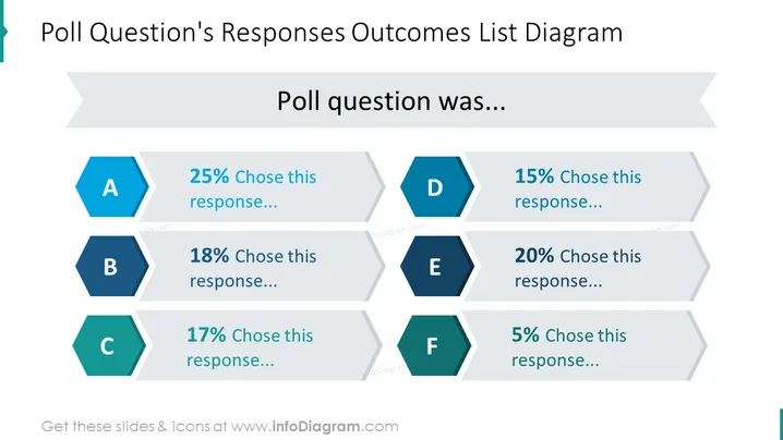
Die Folie präsentiert die Ergebnisse einer Umfragefrage mit sechs Antwortmöglichkeiten, gekennzeichnet von A bis F. Jede Antwortoption hat einen zugehörigen Prozentsatz, der den Anteil der Teilnehmer angibt, die diese Option gewählt haben. Antwort A wurde von 25 % gewählt, was darauf hindeutet, dass sie am beliebtesten war. Antwort B mit 18 % und Antwort C mit 17 % wurden moderat ausgewählt. Antwort D hatte eine etwas geringere Präferenz von 15 %, während Antwort E von 20 % der Befragten bevorzugt wurde. Am wenigsten bevorzugt ist Antwort F, bei der nur 5 % sie auswählten. Diese visuelle Anordnung vermittelt effektiv die Verteilung der Umfragantworten.
Die Folie nutzt ein sauberes und modernes Design mit kontrastierenden Farben und geometrischen Formen, um den Fokus auf die Schlüsselinformationen zu lenken. Die Verwendung von Sechsecken für die Antworten und der Fluss der Prozentbalken schafft ein dynamisches, aber organisiertes Erscheinungsbild.



