Your graphics add a nice touch to my presentations and I recently used them for one of my all-hands meetings. Your toolbox adds professionalism to my slides. Instead of using standard clipart.
Claude Jones, Director of Engineer, @Walmartlabs, USA
Your graphics add a nice touch to my presentations and I recently used them for one of my all-hands meetings. Your toolbox adds professionalism to my slides. Instead of using standard clipart.
Claude Jones, Director of Engineer, @Walmartlabs, USA
I needed a fresh look at some of my slides. I've tried to find a way to create a paintbrush effect, to underline, accentuate, add some color and the handwritten markers were just the things. Very easy to use, easy to size, change the color. It was an affordable, perfect solution and I'm happy to recommend it.
Anonymous, US
The crisp, clean look of the graphics, and the fact that it allowed me to easily edit and change the colors to match the template was my main reason for purchasing them.
Brandie Jenkins, E-learning Developer, USA
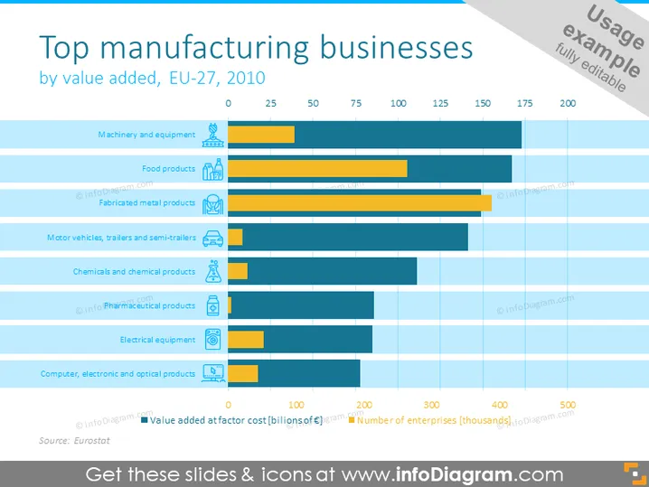
Diese Folie präsentiert einen Vergleich der wichtigsten Fertigungssektoren in der EU-27-Region im Jahr 2010, basierend auf ihrer Wertschöpfung. Jeder Sektor wird durch ein horizontales Balkendiagramm dargestellt, das in zwei Teile unterteilt ist: einer zeigt die "Wertschöpfung zu Faktorkosten (Milliarden Euro)" und der andere die "Anzahl der Unternehmen (Tausende)". Zu den Sektoren gehören Maschinen und Ausrüstungen, Lebensmittelprodukte, bearbeitete Metallprodukte, Kraftfahrzeuge, Anhänger und Semi-Anhänger, Chemikalien und chemische Produkte, pharmazeutische Produkte, elektrische Ausrüstungen sowie Computer-, Elektronik- und optische Produkte.
Die Folie ist visuell gut organisiert, mit einer klaren Unterscheidung zwischen der Wertschöpfung und der Anzahl der Unternehmen für jeden Fertigungssektor. Die kontrastierenden blauen Balken erleichtern das Unterscheiden zwischen den beiden verglichenen Metriken.


