

Your graphics add a nice touch to my presentations and I recently used them for one of my all-hands meetings. Your toolbox adds professionalism to my slides. Instead of using standard clipart.
Claude Jones, Director of Engineer, @Walmartlabs, USA

Your graphics add a nice touch to my presentations and I recently used them for one of my all-hands meetings. Your toolbox adds professionalism to my slides. Instead of using standard clipart.
Claude Jones, Director of Engineer, @Walmartlabs, USA
I needed a fresh look at some of my slides. I've tried to find a way to create a paintbrush effect, to underline, accentuate, add some color and the handwritten markers were just the things. Very easy to use, easy to size, change the color. It was an affordable, perfect solution and I'm happy to recommend it.
Anonymous, US
The crisp, clean look of the graphics, and the fact that it allowed me to easily edit and change the colors to match the template was my main reason for purchasing them.
Brandie Jenkins, E-learning Developer, USA
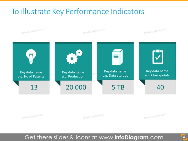
Die Folie soll verschiedene Schlüsselkennzahlen (KPIs) mit Beispielen wie 'Anzahl der Patente', 'Produktion', 'Datenspeicherung' und 'Prüfpunkte' präsentieren. Jede KPI wird durch einen numerischen Wert neben einem suggestiven Symbol dargestellt. Zum Beispiel wird die KPI 'Anzahl der Patente' mit einem Glühbirnensymbol und einem Wert von 13 gezeigt, was innovative Leistungen darstellen könnte. 'Produktion' wird durch ein Zahnrad-Symbol mit der Zahl 20.000 angezeigt, das möglicherweise die Produktionsniveaus widerspiegelt. 'Datenspeicherung' zeigt ein Dokumenten-Symbol und 5 TB, um die Speicherkapazität zu quantifizieren. Schließlich wird 'Prüfpunkte' mit einem Häkchen und der Zahl 40 dargestellt, was möglicherweise auf erreichte Ziele oder Vorgaben hinweist.
Der Gesamteindruck ist modern, minimalistisch und professionell, mit einer Farbpalette, die angenehm für die Augen ist. Die Verwendung von Symbolen und großen Zahlen macht die Daten auf einen Blick leicht verdaulich.



