

Your graphics add a nice touch to my presentations and I recently used them for one of my all-hands meetings. Your toolbox adds professionalism to my slides. Instead of using standard clipart.
Claude Jones, Director of Engineer, @Walmartlabs, USA

Your graphics add a nice touch to my presentations and I recently used them for one of my all-hands meetings. Your toolbox adds professionalism to my slides. Instead of using standard clipart.
Claude Jones, Director of Engineer, @Walmartlabs, USA
I needed a fresh look at some of my slides. I've tried to find a way to create a paintbrush effect, to underline, accentuate, add some color and the handwritten markers were just the things. Very easy to use, easy to size, change the color. It was an affordable, perfect solution and I'm happy to recommend it.
Anonymous, US
The crisp, clean look of the graphics, and the fact that it allowed me to easily edit and change the colors to match the template was my main reason for purchasing them.
Brandie Jenkins, E-learning Developer, USA
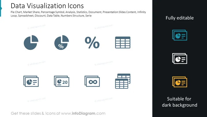
Datenvisualisierungs-Icons werden als eine Sammlung von Symbolen dargestellt, die mit der Darstellung von Diagrammen und statistischer Analyse verbunden sind. Jedes Icon steht für einen anderen Aspekt der Datenvisualisierung, zum Beispiel das Kreisdiagramm, um Teile eines Ganzen zu zeigen, den Marktanteil, um die Wettbewerbsposition darzustellen, das Prozentzeichen für quantitative Proportionen, Analyse zur Aufschlüsselung komplexer Informationen, Statistik zur Zusammenfassung von Datentrends und so weiter. Diese Icons dienen als visuelle Kurzfassung komplexer Konzepte, die auf einen Blick verständlich sind.
Die Folie hat ein sauberes, professionelles Erscheinungsbild mit einem ausgewogenen Layout, das die editierbaren Icons gegen sowohl helle als auch dunkle Hintergründe kontrastiert. Die Icons sind stilisiert und abstrakt, aber sofort erkennbar für jeden, der mit Tools und Konzepten der Datenvisualisierung vertraut ist.



