Your graphics add a nice touch to my presentations and I recently used them for one of my all-hands meetings. Your toolbox adds professionalism to my slides. Instead of using standard clipart.
Claude Jones, Director of Engineer, @Walmartlabs, USA
Your graphics add a nice touch to my presentations and I recently used them for one of my all-hands meetings. Your toolbox adds professionalism to my slides. Instead of using standard clipart.
Claude Jones, Director of Engineer, @Walmartlabs, USA
I needed a fresh look at some of my slides. I've tried to find a way to create a paintbrush effect, to underline, accentuate, add some color and the handwritten markers were just the things. Very easy to use, easy to size, change the color. It was an affordable, perfect solution and I'm happy to recommend it.
Anonymous, US
The crisp, clean look of the graphics, and the fact that it allowed me to easily edit and change the colors to match the template was my main reason for purchasing them.
Brandie Jenkins, E-learning Developer, USA
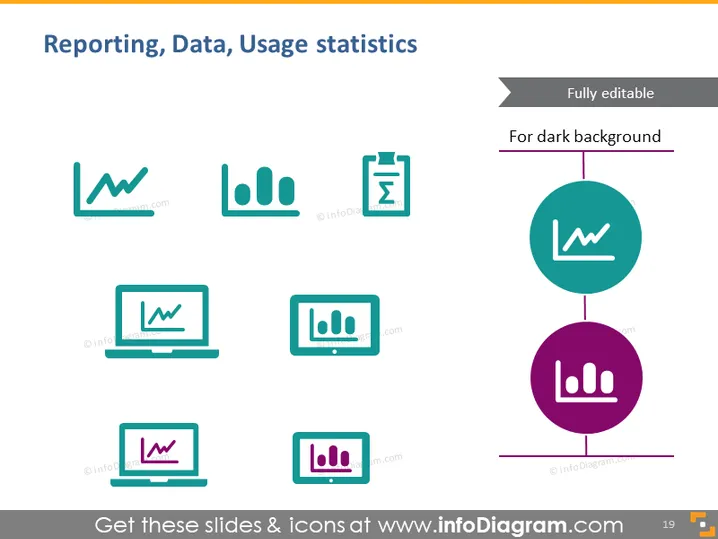
Die PowerPoint-Folie trägt den Titel "Berichterstattung, Daten, Nutzungsstatistiken" und zeigt eine Sammlung von Symbolen und Infografiken, die verschiedene Aspekte des Datenmanagements und der Analyse darstellen. Die Folie hebt wesentliche Werkzeuge und Prozesse hervor, die für die Berichterstattung und die Visualisierung von Nutzungsstatistiken verwendet werden, wie z. B. grafische Symbole, ein Clipboard mit einem Häkchen und Laptop-Bildschirme mit Daten darstellungen. Jedes Symbol repräsentiert einen anderen Aspekt der Dateninteraktion: Liniendiagramm für Trendanalysen, Balkendiagramm für Vergleiche, Clipboard für die Datenverifizierung und Laptops für die Datenverarbeitung und -präsentation.
Die Folie hat ein sauberes, modernes Aussehen mit einem klaren Layout, das die Symbole betont. Der Einsatz von Farben ist subtil, hauptsächlich in Teal und Lila gehalten, was einen Hauch von visuellem Interesse hinzufügt, ohne überwältigend zu sein.


