Your graphics add a nice touch to my presentations and I recently used them for one of my all-hands meetings. Your toolbox adds professionalism to my slides. Instead of using standard clipart.
Claude Jones, Director of Engineer, @Walmartlabs, USA
Your graphics add a nice touch to my presentations and I recently used them for one of my all-hands meetings. Your toolbox adds professionalism to my slides. Instead of using standard clipart.
Claude Jones, Director of Engineer, @Walmartlabs, USA
I needed a fresh look at some of my slides. I've tried to find a way to create a paintbrush effect, to underline, accentuate, add some color and the handwritten markers were just the things. Very easy to use, easy to size, change the color. It was an affordable, perfect solution and I'm happy to recommend it.
Anonymous, US
The crisp, clean look of the graphics, and the fact that it allowed me to easily edit and change the colors to match the template was my main reason for purchasing them.
Brandie Jenkins, E-learning Developer, USA
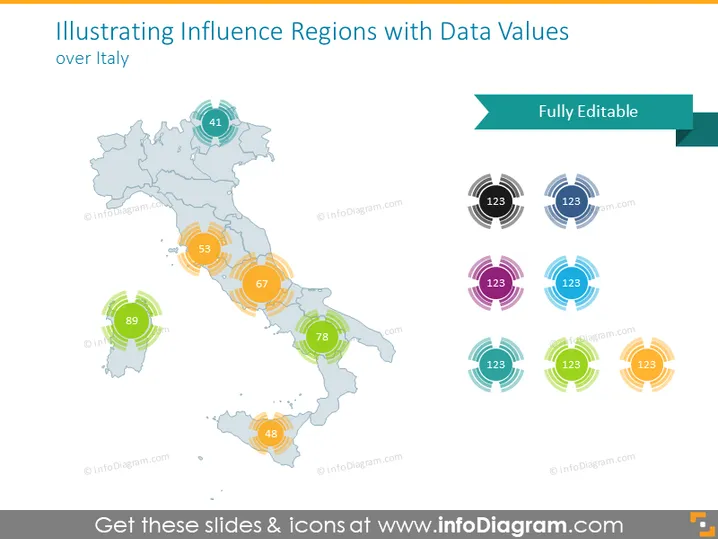
Die Folie zeigt eine Karte von Italien, die in Regionen unterteilt ist, mit überlagerten numerischen Datenwerten, die die regionale Einflussnahme oder Kennzahlen anzeigen. Jede Region ist mit einem kreisförmigen, farbigen Grafik verbunden, die eine Zahl enthält, die ein quantifizierbares Attribut oder Leistungsindikator für dieses bestimmte Gebiet vorschlägt. Diese Zahlen repräsentieren vermutlich Daten wie Bevölkerung, wirtschaftliche Kennzahlen oder andere regionsspezifische Statistiken, die für die Analyse von entscheidender Bedeutung sind.
Das Folien-Design ist klar und modern mit einer Farbpalette, die koordiniert, aber dennoch deutlich genug ist, um zwischen den Datenwerten zu unterscheiden. Die kreisförmigen Grafiken fügen eine dynamische Note hinzu und verbinden visuell die Daten mit ihren jeweiligen Regionen auf der Karte.


