Your graphics add a nice touch to my presentations and I recently used them for one of my all-hands meetings. Your toolbox adds professionalism to my slides. Instead of using standard clipart.
Claude Jones, Director of Engineer, @Walmartlabs, USA
Your graphics add a nice touch to my presentations and I recently used them for one of my all-hands meetings. Your toolbox adds professionalism to my slides. Instead of using standard clipart.
Claude Jones, Director of Engineer, @Walmartlabs, USA
I needed a fresh look at some of my slides. I've tried to find a way to create a paintbrush effect, to underline, accentuate, add some color and the handwritten markers were just the things. Very easy to use, easy to size, change the color. It was an affordable, perfect solution and I'm happy to recommend it.
Anonymous, US
The crisp, clean look of the graphics, and the fact that it allowed me to easily edit and change the colors to match the template was my main reason for purchasing them.
Brandie Jenkins, E-learning Developer, USA
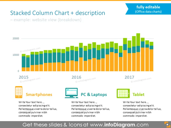
Die Folie zeigt ein gestapeltes Säulendiagramm, das eine Aufschlüsselung der Seitenaufrufe einer Website nach Gerätekategorie über einen Zeitraum von drei Jahren – 2015 bis 2017 – darstellt. Jedes Jahr wird durch eine Gruppe von Säulen in verschiedenen Farben repräsentiert, die die Anzahl der Aufrufe von Smartphones, PCs & Laptops sowie Tablets anzeigen. Unter jeder Kategorie befindet sich ein Platzhalter für zusätzlichen Text, vermutlich um spezifischere Details oder Analysen zu dieser Kategorie bereitzustellen. Diese Folie soll Daten, basierend auf kategorialen Unterteilungen im Zeitverlauf, visualisieren und vergleichen.
Die Folie ist mit einem sauberen, professionellen Look gestaltet, der ein einheitliches Farbschema aufweist. Das Diagramm ist eindeutig der Fokus und bietet eine visuelle Darstellung von Daten, die auf einen Blick leicht verständlich ist.


