Your graphics add a nice touch to my presentations and I recently used them for one of my all-hands meetings. Your toolbox adds professionalism to my slides. Instead of using standard clipart.
Claude Jones, Director of Engineer, @Walmartlabs, USA
Your graphics add a nice touch to my presentations and I recently used them for one of my all-hands meetings. Your toolbox adds professionalism to my slides. Instead of using standard clipart.
Claude Jones, Director of Engineer, @Walmartlabs, USA
I needed a fresh look at some of my slides. I've tried to find a way to create a paintbrush effect, to underline, accentuate, add some color and the handwritten markers were just the things. Very easy to use, easy to size, change the color. It was an affordable, perfect solution and I'm happy to recommend it.
Anonymous, US
The crisp, clean look of the graphics, and the fact that it allowed me to easily edit and change the colors to match the template was my main reason for purchasing them.
Brandie Jenkins, E-learning Developer, USA
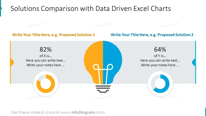
Die PowerPoint-Folie präsentiert eine vergleichende Analyse von zwei Lösungen, die jeweils durch ein datengetriebenes Excel-Diagramm ergänzt werden. Auf der linken Seite wird "Vorgeschlagene Lösung 1" mit einem 82%-Wert angezeigt, begleitet von Platz für zusätzlichen Text und Notizen. Auf der rechten Seite wird "Vorgeschlagene Lösung 2" mit einem 64%-Wert vorgestellt, die ebenfalls Bereiche zur Ausarbeitung der Lösung bietet. Jede Sektion verwendet ein kreisförmiges Diagramm, um die Prozentdaten visuell zu unterstreichen, was unterschiedliche Abschlüsse oder Erfolge anzeigt.
Die Folie verwendet ein sauberes und professionelles Design mit kontrastierenden Farbschemata, um zwischen den beiden Lösungen zu unterscheiden. Das zentrale Glühbirnen-Icon dient sowohl als thematisches Element in Bezug auf Innovation als auch als visuelle Trennung des Inhalts.


