Your graphics add a nice touch to my presentations and I recently used them for one of my all-hands meetings. Your toolbox adds professionalism to my slides. Instead of using standard clipart.
Claude Jones, Director of Engineer, @Walmartlabs, USA
Your graphics add a nice touch to my presentations and I recently used them for one of my all-hands meetings. Your toolbox adds professionalism to my slides. Instead of using standard clipart.
Claude Jones, Director of Engineer, @Walmartlabs, USA
I needed a fresh look at some of my slides. I've tried to find a way to create a paintbrush effect, to underline, accentuate, add some color and the handwritten markers were just the things. Very easy to use, easy to size, change the color. It was an affordable, perfect solution and I'm happy to recommend it.
Anonymous, US
The crisp, clean look of the graphics, and the fact that it allowed me to easily edit and change the colors to match the template was my main reason for purchasing them.
Brandie Jenkins, E-learning Developer, USA
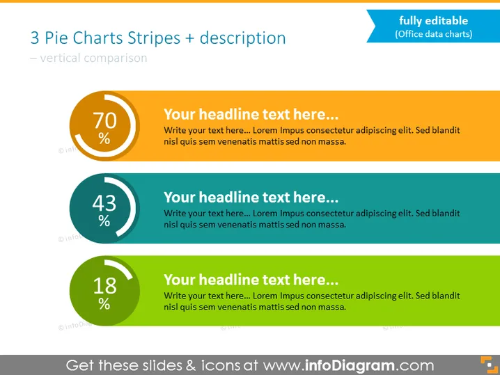
Die PowerPoint-Folie präsentiert einen Vergleich von drei statistischen Werten mithilfe von Tortendiagrammen und begleitendem Text. Jedes Diagramm hat einen großen Prozentsatz in der Mitte, was darauf hindeutet, dass sie Teile eines Ganzen messen. Das erste Diagramm ist orange mit 70%, das zweite ist türkis mit 43% und das dritte ist grün mit 18%. Die Tortendiagramme sind mit Platzhalterüberschriften und Text kombiniert, was auf eine Vorlage hinweist, die mit spezifischen Daten und Beschreibungen angepasst werden kann. Die drei Abschnitte bieten eine klare visuelle Hierarchie zum Vergleich der Prozentwerte und bieten Platz für beschreibenden Inhalt.
Das allgemeine Erscheinungsbild der Folie ist sauber und modern, mit einem Farbschema, das die drei Datenpunkte effektiv voneinander unterscheidet. Die Verwendung kontrastierender Farben ergänzt die visuelle Hierarchie, die für die Datenvergleiche vorgesehen ist.


