Your graphics add a nice touch to my presentations and I recently used them for one of my all-hands meetings. Your toolbox adds professionalism to my slides. Instead of using standard clipart.
Claude Jones, Director of Engineer, @Walmartlabs, USA
Your graphics add a nice touch to my presentations and I recently used them for one of my all-hands meetings. Your toolbox adds professionalism to my slides. Instead of using standard clipart.
Claude Jones, Director of Engineer, @Walmartlabs, USA
I needed a fresh look at some of my slides. I've tried to find a way to create a paintbrush effect, to underline, accentuate, add some color and the handwritten markers were just the things. Very easy to use, easy to size, change the color. It was an affordable, perfect solution and I'm happy to recommend it.
Anonymous, US
The crisp, clean look of the graphics, and the fact that it allowed me to easily edit and change the colors to match the template was my main reason for purchasing them.
Brandie Jenkins, E-learning Developer, USA
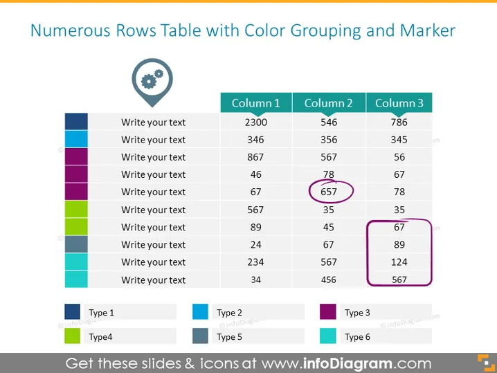
Die Folie zeigt eine Tabelle zur Datenklassifizierung mit farblich codierten Zeilen, die verschiedene Gruppen oder Kategorien anzeigen. Jede Zeile hat Platzhalter für Text und die Spalten sind mit "Spalte 1", "Spalte 2" und "Spalte 3" beschriftet, mit numerischen Daten. Einige Zahlen sind eingekreist, um bestimmte Datenpunkte hervorzuheben. Unter der Tabelle befindet sich eine Legende, die Farben einzelnen Typen zuordnet, wie "Typ 1", "Typ 3" und so weiter, was ein System zur Klassifizierung der Daten in der Tabelle nach verschiedenen Kriterien oder Kategorien anzeigt.
Die Folie hat ein sauberes und professionelles Aussehen, mit einem einfachen Farbschema zur Unterscheidung der Datenkategorien. Der Einsatz von Kreisen zur Hervorhebung bestimmter Datenpunkte zieht die Aufmerksamkeit des Betrachters effektiv an.


