Your graphics add a nice touch to my presentations and I recently used them for one of my all-hands meetings. Your toolbox adds professionalism to my slides. Instead of using standard clipart.
Claude Jones, Director of Engineer, @Walmartlabs, USA
Your graphics add a nice touch to my presentations and I recently used them for one of my all-hands meetings. Your toolbox adds professionalism to my slides. Instead of using standard clipart.
Claude Jones, Director of Engineer, @Walmartlabs, USA
I needed a fresh look at some of my slides. I've tried to find a way to create a paintbrush effect, to underline, accentuate, add some color and the handwritten markers were just the things. Very easy to use, easy to size, change the color. It was an affordable, perfect solution and I'm happy to recommend it.
Anonymous, US
The crisp, clean look of the graphics, and the fact that it allowed me to easily edit and change the colors to match the template was my main reason for purchasing them.
Brandie Jenkins, E-learning Developer, USA
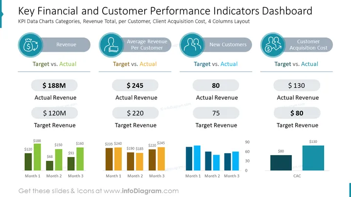
Die Folie zeigt ein Dashboard zur Analyse wichtiger Leistungsindikatoren (KPIs) im Zusammenhang mit Finanzen und Kundenmetriken. Es ist in vier Kategorien unterteilt: Umsatz, Durchschnittlicher Umsatz pro Kunde, Neue Kunden und Kundenakquisitionskosten. Jede Kategorie enthält einen Vergleich von 'Ziel vs. Ist'.
Jede Kategorie enthält ein Diagramm mit einem Trendverlauf über drei Monate, das die monatliche Leistung im Verhältnis zu den Zielen darstellt.
Die Folie ist visuell ausgewogen mit einem klaren und professionellen Design, das eine konsistente Farbpalette und klare Typografie nutzt, um komplexe Daten effektiv zu vermitteln. Sie ist darauf ausgelegt, einen schnellen, übersichtlichen Vergleich der Unternehmensleistungsmetriken gegenüber festgelegten Zielen zu bieten.


