Your graphics add a nice touch to my presentations and I recently used them for one of my all-hands meetings. Your toolbox adds professionalism to my slides. Instead of using standard clipart.
Claude Jones, Director of Engineer, @Walmartlabs, USA
Your graphics add a nice touch to my presentations and I recently used them for one of my all-hands meetings. Your toolbox adds professionalism to my slides. Instead of using standard clipart.
Claude Jones, Director of Engineer, @Walmartlabs, USA
I needed a fresh look at some of my slides. I've tried to find a way to create a paintbrush effect, to underline, accentuate, add some color and the handwritten markers were just the things. Very easy to use, easy to size, change the color. It was an affordable, perfect solution and I'm happy to recommend it.
Anonymous, US
The crisp, clean look of the graphics, and the fact that it allowed me to easily edit and change the colors to match the template was my main reason for purchasing them.
Brandie Jenkins, E-learning Developer, USA
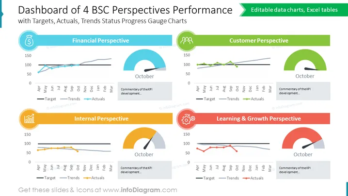
Die Folie präsentiert ein Leistungs-Dashboard, das 4 Perspektiven der Balanced Scorecard (BSC) umfasst: Finanzen, Kunden, Intern und Lernen & Wachstum. Jede Perspektive wird mit einem Liniendiagramm visualisiert, das drei verschiedene Kennzahlen - Ziel, Trends und Istwerte - über einen monatlichen Zeitraum von April bis März verfolgt. Darüber hinaus enthält jede Perspektive eine halbrunde Fortschrittsanzeige für Oktober und ein Kommentarfeld für Einsichten zur Entwicklung der KPIs. Das Ziel wird durch eine durchgezogene Linie angezeigt, Trends durch eine gestrichelte Linie und Istwerte durch eine Linie mit Diamantenmarkierungen.
Die grafischen Objekte verwenden ein flaches Design mit kräftigen Farbblöcken, um zwischen den Perspektiven zu differenzieren. Die Icons sind einfach und repräsentativ, was die Klarheit und thematische Assoziation verbessert. Der Gesamteindruck ist sauber, modern und geschäftsorientiert, mit einem Fokus auf Datenvisualisierung.


