

Your graphics add a nice touch to my presentations and I recently used them for one of my all-hands meetings. Your toolbox adds professionalism to my slides. Instead of using standard clipart.
Claude Jones, Director of Engineer, @Walmartlabs, USA

Your graphics add a nice touch to my presentations and I recently used them for one of my all-hands meetings. Your toolbox adds professionalism to my slides. Instead of using standard clipart.
Claude Jones, Director of Engineer, @Walmartlabs, USA
I needed a fresh look at some of my slides. I've tried to find a way to create a paintbrush effect, to underline, accentuate, add some color and the handwritten markers were just the things. Very easy to use, easy to size, change the color. It was an affordable, perfect solution and I'm happy to recommend it.
Anonymous, US
The crisp, clean look of the graphics, and the fact that it allowed me to easily edit and change the colors to match the template was my main reason for purchasing them.
Brandie Jenkins, E-learning Developer, USA
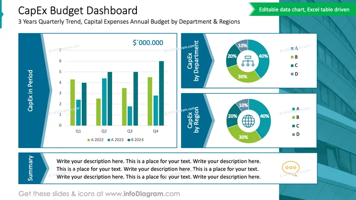
Diese PowerPoint-Folie trägt den Titel „CapEx Budget Dashboard“ und zeigt einen 3-Jahres-Quartalstrend sowie das jährliche Kapitalaufwandsbudget nach Abteilungen und Regionen. Die Folie ist in drei Abschnitte gegliedert: ein Balkendiagramm, das die Kapitalkosten (CapEx) über vier Quartale zweier verschiedener Jahre darstellt, und zwei Donut-Diagramme, die die Ausgaben nach Abteilung und Region aufschlüsseln. Jeder Abschnitt ist klar beschriftet, und die Donut-Diagramme zeigen prozentuale Aufschlüsselungen für vier Kategorien, bezeichnet als A, B, C und D, wodurch der Betrachter die Verteilung der CapEx schnell beurteilen kann.
Die Folie besticht durch ein klares und professionelles Layout mit einer guten Balance aus Text, Diagrammen und ästhetischen Gestaltungselementen. Die kontrastierenden Blau- und Grüntöne sorgen für visuelles Interesse und helfen bei der Unterscheidung verschiedener Datenpunkte.



