Your graphics add a nice touch to my presentations and I recently used them for one of my all-hands meetings. Your toolbox adds professionalism to my slides. Instead of using standard clipart.
Claude Jones, Director of Engineer, @Walmartlabs, USA
Your graphics add a nice touch to my presentations and I recently used them for one of my all-hands meetings. Your toolbox adds professionalism to my slides. Instead of using standard clipart.
Claude Jones, Director of Engineer, @Walmartlabs, USA
I needed a fresh look at some of my slides. I've tried to find a way to create a paintbrush effect, to underline, accentuate, add some color and the handwritten markers were just the things. Very easy to use, easy to size, change the color. It was an affordable, perfect solution and I'm happy to recommend it.
Anonymous, US
The crisp, clean look of the graphics, and the fact that it allowed me to easily edit and change the colors to match the template was my main reason for purchasing them.
Brandie Jenkins, E-learning Developer, USA
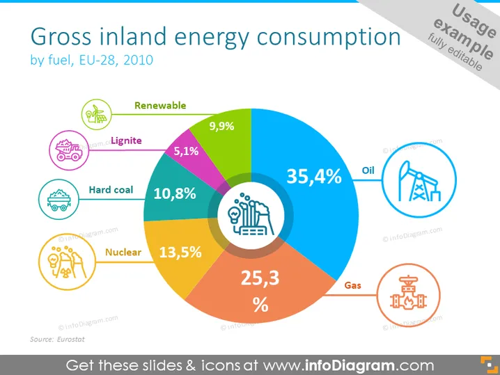
Die Folie präsentiert Daten zum "Bruttoinlandsenergieverbrauch nach Energieträger, EU-28, 2010" und zeigt ein buntes Tortendiagramm, das die prozentuale Verteilung des Energieverbrauchs nach Energieträger aufschlüsselt. Öl ist die Hauptquelle mit 35,4 %, gefolgt von Gas (25,3 %), Kernenergie (13,5 %), Steinkohle (10,8 %), Erneuerbaren (9,9 %) und Braunkohle (5,1 %). Jeder Energieträger ist mit einem einzigartigen Icon verbunden, das hilft, diese visuell zu unterscheiden. "Erneuerbare" bezieht sich auf nachhaltige Energiequellen wie Wind oder Solar, "Braunkohle" und "Steinkohle" sind Kohlearten, "Kernenergie" bezieht sich auf Energie aus nuklearen Reaktionen, und "Öl" und "Gas" sind gängige fossile Brennstoffe.
Die Folie hat ein sauberes, professionelles Aussehen mit einem Fokus auf Lesbarkeit und Datenvisualisierung. Die Farb- und Ikonwahl verbessert das Verständnis und die visuelle Anziehungskraft.


