Your graphics add a nice touch to my presentations and I recently used them for one of my all-hands meetings. Your toolbox adds professionalism to my slides. Instead of using standard clipart.
Claude Jones, Director of Engineer, @Walmartlabs, USA
Your graphics add a nice touch to my presentations and I recently used them for one of my all-hands meetings. Your toolbox adds professionalism to my slides. Instead of using standard clipart.
Claude Jones, Director of Engineer, @Walmartlabs, USA
I needed a fresh look at some of my slides. I've tried to find a way to create a paintbrush effect, to underline, accentuate, add some color and the handwritten markers were just the things. Very easy to use, easy to size, change the color. It was an affordable, perfect solution and I'm happy to recommend it.
Anonymous, US
The crisp, clean look of the graphics, and the fact that it allowed me to easily edit and change the colors to match the template was my main reason for purchasing them.
Brandie Jenkins, E-learning Developer, USA
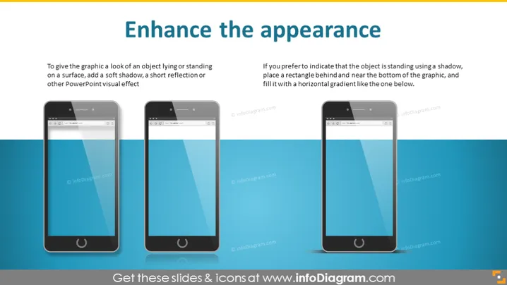
Diese PowerPoint-Folie mit dem Titel "Erscheinungsbild verbessern" bietet Tipps zur Verbesserung der visuellen Attraktivität von Grafiken innerhalb von Präsentationen. Sie vergleicht zwei Methoden, um Grafiken das Aussehen eines Objekts zu geben, das auf einer Oberfläche liegt oder steht. Die linke Seite schlägt vor, einen weichen Schatten oder eine Reflexion für einen subtileren Effekt hinzuzufügen. Ein weicher Schatten unter einem Objekt erweckt den Eindruck von Tiefe und lässt es geerdet erscheinen. Ebenso kann eine Reflexion auf eine glänzende Oberfläche unter dem Objekt hindeuten. Rechts wird empfohlen, einen Schatten und einen horizontalen Farbverlauf hinter dem Objekt zu verwenden, um einen ausgeprägteren Steheffekt zu erzielen. Der Schatten erzeugt die Illusion, dass das Objekt erhöht ist, während der Farbverlauf als visueller Anker dient und die Wahrnehmung von Tiefe verbessert.


