Your graphics add a nice touch to my presentations and I recently used them for one of my all-hands meetings. Your toolbox adds professionalism to my slides. Instead of using standard clipart.
Claude Jones, Director of Engineer, @Walmartlabs, USA
Your graphics add a nice touch to my presentations and I recently used them for one of my all-hands meetings. Your toolbox adds professionalism to my slides. Instead of using standard clipart.
Claude Jones, Director of Engineer, @Walmartlabs, USA
I needed a fresh look at some of my slides. I've tried to find a way to create a paintbrush effect, to underline, accentuate, add some color and the handwritten markers were just the things. Very easy to use, easy to size, change the color. It was an affordable, perfect solution and I'm happy to recommend it.
Anonymous, US
The crisp, clean look of the graphics, and the fact that it allowed me to easily edit and change the colors to match the template was my main reason for purchasing them.
Brandie Jenkins, E-learning Developer, USA
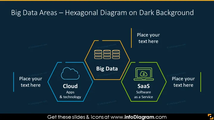
Diese Folie bietet eine grafische Darstellung der Big Data Bereiche mithilfe eines sechseckigen Diagramms. Es umfasst drei Schlüsselkomponenten: Cloud (Hervorhebung von Apps und Technologien), Big Data und SaaS (Software as a Service), jeweils innerhalb des eigenen Sechsecks. Die Anordnung deutet auf eine verbundene Beziehung zwischen den drei Bereichen hin, die integraler Bestandteil der Infrastruktur von Big Data Technologien sind. Textplatzhalter deuten darauf hin, dass die Vorlage für die Anpassung an die spezifischen Inhalte des Präsentierenden konzipiert wurde.
Der dunkle Hintergrund der Folie hebt sich scharf von den lebhaften Umrandungen und Icons ab und lenkt die Aufmerksamkeit auf die miteinander verbundenen Sechsecke und ihre jeweiligen Bereiche der Big Data Technologien. Das Design ist elegant und modern, mit einem klaren Fokus auf das Diagramm in der Mitte.


