Your graphics add a nice touch to my presentations and I recently used them for one of my all-hands meetings. Your toolbox adds professionalism to my slides. Instead of using standard clipart.
Claude Jones, Director of Engineer, @Walmartlabs, USA
Your graphics add a nice touch to my presentations and I recently used them for one of my all-hands meetings. Your toolbox adds professionalism to my slides. Instead of using standard clipart.
Claude Jones, Director of Engineer, @Walmartlabs, USA
I needed a fresh look at some of my slides. I've tried to find a way to create a paintbrush effect, to underline, accentuate, add some color and the handwritten markers were just the things. Very easy to use, easy to size, change the color. It was an affordable, perfect solution and I'm happy to recommend it.
Anonymous, US
The crisp, clean look of the graphics, and the fact that it allowed me to easily edit and change the colors to match the template was my main reason for purchasing them.
Brandie Jenkins, E-learning Developer, USA
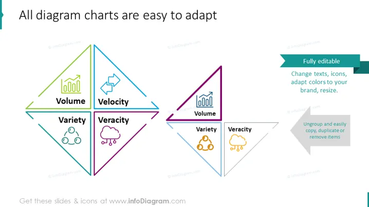
Die PowerPoint-Folie zeigt die Leichtigkeit, verschiedene Diagrammdiagramme anzupassen, und konzentriert sich auf vier wichtige Attribute: Volumen, Geschwindigkeit, Vielfalt und Wahrhaftigkeit. Jedes Attribut wird mit unterschiedlichen Farben und Symbolen konzipiert - Volumen wird durch ein Balkendiagramm-Icon dargestellt, das eine Datenmenge impliziert; Geschwindigkeit mit einem Stern, der Bewegung oder Schnelligkeit suggeriert; Vielfalt wird mit einem Netzsymbol gezeigt, das Vielfalt darstellt; und Wahrhaftigkeit mit Wolken, die möglicherweise abstrakte oder qualitative Daten repräsentieren.
Die Folie präsentiert ein sauberes und modernes Design mit einem farbenfrohen geometrischen Fokus, der die Anpassungsfähigkeit der Diagrammelemente visuell kategorisiert und betont.


