Your graphics add a nice touch to my presentations and I recently used them for one of my all-hands meetings. Your toolbox adds professionalism to my slides. Instead of using standard clipart.
Claude Jones, Director of Engineer, @Walmartlabs, USA
Your graphics add a nice touch to my presentations and I recently used them for one of my all-hands meetings. Your toolbox adds professionalism to my slides. Instead of using standard clipart.
Claude Jones, Director of Engineer, @Walmartlabs, USA
I needed a fresh look at some of my slides. I've tried to find a way to create a paintbrush effect, to underline, accentuate, add some color and the handwritten markers were just the things. Very easy to use, easy to size, change the color. It was an affordable, perfect solution and I'm happy to recommend it.
Anonymous, US
The crisp, clean look of the graphics, and the fact that it allowed me to easily edit and change the colors to match the template was my main reason for purchasing them.
Brandie Jenkins, E-learning Developer, USA
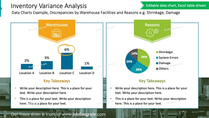
Die Folie präsentiert eine Analyse der Bestandsabweichungen, die sich auf Diskrepanzen an verschiedenen Lagerstandorten und die Gründe für solche Diskrepanzen, wie Schwund oder Schäden, konzentriert. Auf der linken Seite zeigt ein Balkendiagramm die Prozentsätze der Abweichungen an vier Standorten, die als Standort A bis Standort D bezeichnet sind. Die rechte Seite zeigt ein Kreisdiagramm mit den häufigsten Gründen für Bestandsabweichungen - Schwund, Systemfehler, Schäden und andere - jeweils mit einem entsprechenden Prozentsatz. Unter jedem Diagramm befindet sich ein Abschnitt für "Wichtige Erkenntnisse", in dem spezifische Einblicke aus den Daten vertieft werden können.


