Your graphics add a nice touch to my presentations and I recently used them for one of my all-hands meetings. Your toolbox adds professionalism to my slides. Instead of using standard clipart.
Claude Jones, Director of Engineer, @Walmartlabs, USA
Your graphics add a nice touch to my presentations and I recently used them for one of my all-hands meetings. Your toolbox adds professionalism to my slides. Instead of using standard clipart.
Claude Jones, Director of Engineer, @Walmartlabs, USA
I needed a fresh look at some of my slides. I've tried to find a way to create a paintbrush effect, to underline, accentuate, add some color and the handwritten markers were just the things. Very easy to use, easy to size, change the color. It was an affordable, perfect solution and I'm happy to recommend it.
Anonymous, US
The crisp, clean look of the graphics, and the fact that it allowed me to easily edit and change the colors to match the template was my main reason for purchasing them.
Brandie Jenkins, E-learning Developer, USA
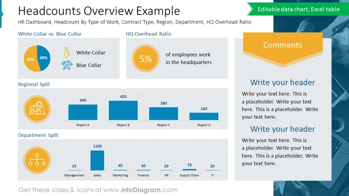
Die Folie bietet eine statistische Aufschlüsselung der Belegschaft einer Organisation, die nach Berufstyp, regionaler Verteilung und Abteilungszugehörigkeit kategorisiert ist. Sie enthält ein Tortendiagramm "Weiße Kragen vs. Blaue Kragen" mit einer Aufteilung von 55 % zu 45 %, ein "HQ Overhead Ratio", das hervorhebt, dass 5 % der Mitarbeiter in der Zentrale arbeiten, eine "Regionale Aufteilung" mit numerischen Verteilungen über vier Regionen und eine "Abteilungsaufteilung", die Mitarbeiterzahlen für die Abteilungen Management, Vertrieb, Marketing, Finanzen, HR, Lieferkette und IT bereitstellt. Jeder Abschnitt wird von Symbolen begleitet, die die Kategorien visuell darstellen, die Datenaufteilungen betonen und ein schnelles Verständnis der strukturellen Demografie des Unternehmens ermöglichen.


