

Your graphics add a nice touch to my presentations and I recently used them for one of my all-hands meetings. Your toolbox adds professionalism to my slides. Instead of using standard clipart.
Claude Jones, Director of Engineer, @Walmartlabs, USA

Your graphics add a nice touch to my presentations and I recently used them for one of my all-hands meetings. Your toolbox adds professionalism to my slides. Instead of using standard clipart.
Claude Jones, Director of Engineer, @Walmartlabs, USA
I needed a fresh look at some of my slides. I've tried to find a way to create a paintbrush effect, to underline, accentuate, add some color and the handwritten markers were just the things. Very easy to use, easy to size, change the color. It was an affordable, perfect solution and I'm happy to recommend it.
Anonymous, US
The crisp, clean look of the graphics, and the fact that it allowed me to easily edit and change the colors to match the template was my main reason for purchasing them.
Brandie Jenkins, E-learning Developer, USA
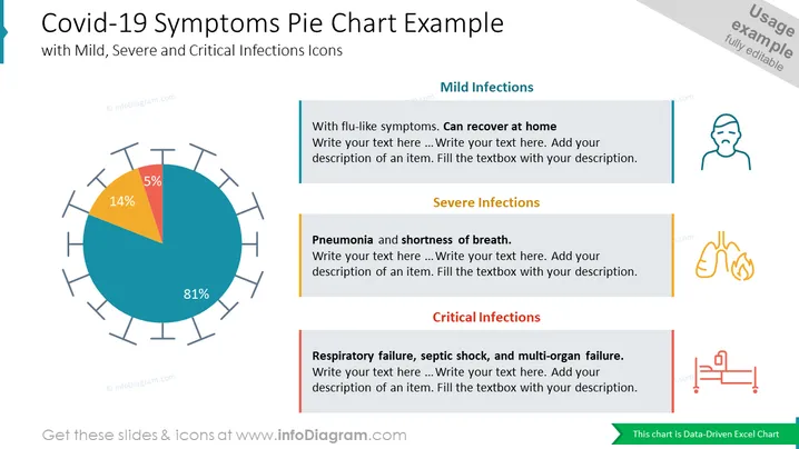
Diese PowerPoint-Folienvorlage bietet eine visuell ansprechende und informative Möglichkeit, Daten zur Schwereverteilung von Covid-19-Infektionen zu präsentieren. Das Tortendiagramm veranschaulicht effektiv den Anteil der Fälle, die in milde, schwere und kritische Kategorien fallen, und ist damit ein ideales Werkzeug für Präsentationen in Epidemiologie, öffentlicher Gesundheit oder Gesundheitsmanagement. Das vielseitige Design der Vorlage ermöglicht Anpassungen, um verschiedenen Präsentationsbedürfnissen gerecht zu werden.



