Your graphics add a nice touch to my presentations and I recently used them for one of my all-hands meetings. Your toolbox adds professionalism to my slides. Instead of using standard clipart.
Claude Jones, Director of Engineer, @Walmartlabs, USA
Your graphics add a nice touch to my presentations and I recently used them for one of my all-hands meetings. Your toolbox adds professionalism to my slides. Instead of using standard clipart.
Claude Jones, Director of Engineer, @Walmartlabs, USA
I needed a fresh look at some of my slides. I've tried to find a way to create a paintbrush effect, to underline, accentuate, add some color and the handwritten markers were just the things. Very easy to use, easy to size, change the color. It was an affordable, perfect solution and I'm happy to recommend it.
Anonymous, US
The crisp, clean look of the graphics, and the fact that it allowed me to easily edit and change the colors to match the template was my main reason for purchasing them.
Brandie Jenkins, E-learning Developer, USA
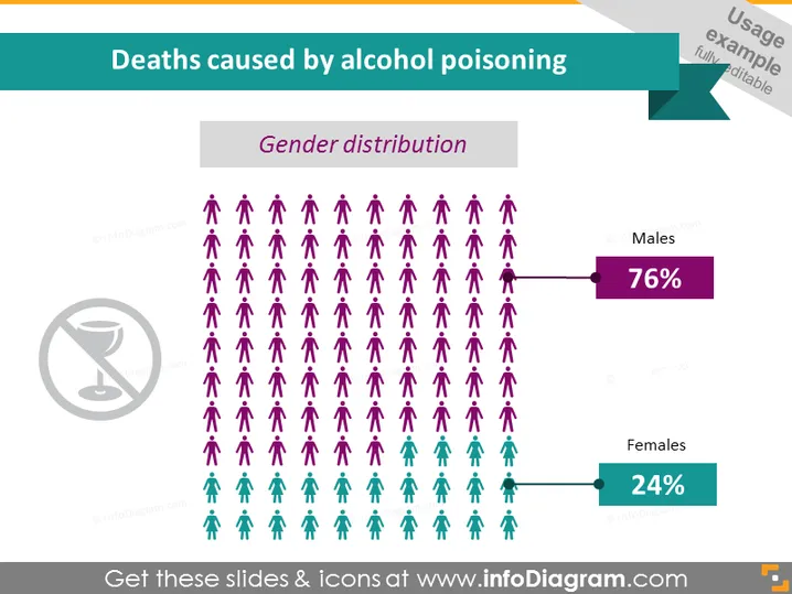
Diese PowerPoint-Folie präsentiert statistische Daten zu "Todesfällen durch Alkoholvergiftung" mit einem Fokus auf die Geschlechterverteilung. Die Folie verwendet visuelle Icons, um die Geschlechterverteilung der Todesfälle darzustellen, wobei männliche Icons in Lila und weibliche Icons in Grün dargestellt werden. Es wird hervorgehoben, dass 76% der Todesfälle Männer sind, was auf eine höhere Verwundbarkeit oder Exposition in der männlichen Bevölkerung hinweist, während 24% Frauen sind, was einen geringeren, aber dennoch signifikanten Prozentsatz anzeigt.
Die Folie ist visuell ausgewogen durch die Verwendung von Icons und farbcodierten Balken, um statistische Informationen zu vermitteln. Der Einsatz von geschlechtsspezifischen Farben und klaren Prozentsätzen kommuniziert deutlich die Geschlechterverteilung der Todesfälle durch Alkoholvergiftung.


