
Your graphics add a nice touch to my presentations and I recently used them for one of my all-hands meetings. Your toolbox adds professionalism to my slides. Instead of using standard clipart.
Claude Jones, Director of Engineer, @Walmartlabs, USA
Your graphics add a nice touch to my presentations and I recently used them for one of my all-hands meetings. Your toolbox adds professionalism to my slides. Instead of using standard clipart.
Claude Jones, Director of Engineer, @Walmartlabs, USA
I needed a fresh look at some of my slides. I've tried to find a way to create a paintbrush effect, to underline, accentuate, add some color and the handwritten markers were just the things. Very easy to use, easy to size, change the color. It was an affordable, perfect solution and I'm happy to recommend it.
Anonymous, US
The crisp, clean look of the graphics, and the fact that it allowed me to easily edit and change the colors to match the template was my main reason for purchasing them.
Brandie Jenkins, E-learning Developer, USA
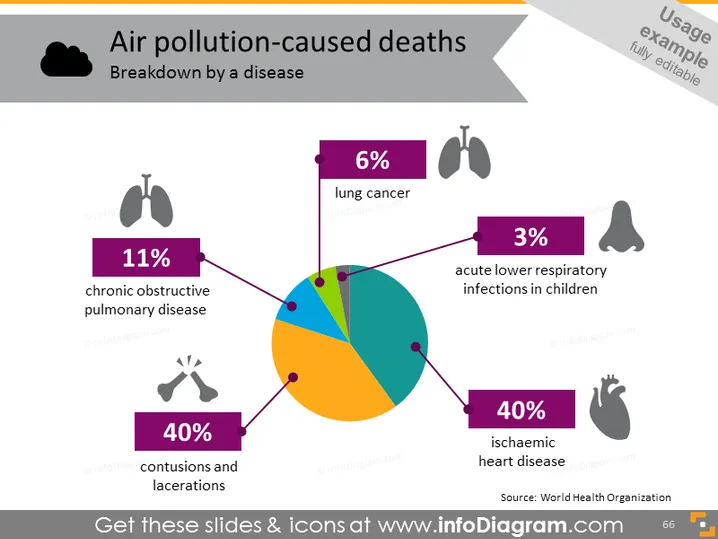
Das Kreisdiagramm zeigt die Aufschlüsselung der durch Luftverschmutzung verursachten Todesfälle nach Krankheiten. Es gibt vier Kategorien, die jeweils durch eine andere Farbe dargestellt und sowohl mit einem Prozentsatz als auch mit dem Namen der Krankheit beschriftet sind: 11% der Todesfälle werden durch chronisch obstruktive Lungenerkrankung verursacht, 40% durch Prellungen und Schnittwunden, 6% durch Lungenkrebs und 40% durch ischämische Herzkrankheit. Die verbleibenden 3% entfallen auf akute Atemwegsinfektionen bei Kindern. Jede Kategorie ist mit einem entsprechenden Icon verbunden, das die Krankheit visuell darstellt.
Die Folie hat ein sauberes und modernes Design, wobei das visuell auffällige Kreisdiagramm eine klare und unmittelbare visuelle Darstellung der Daten bietet. Die Icons sind einfach, aber effektiv darin, das medizinische Thema des Inhalts zu vermitteln.




