Your graphics add a nice touch to my presentations and I recently used them for one of my all-hands meetings. Your toolbox adds professionalism to my slides. Instead of using standard clipart.
Claude Jones, Director of Engineer, @Walmartlabs, USA
Your graphics add a nice touch to my presentations and I recently used them for one of my all-hands meetings. Your toolbox adds professionalism to my slides. Instead of using standard clipart.
Claude Jones, Director of Engineer, @Walmartlabs, USA
I needed a fresh look at some of my slides. I've tried to find a way to create a paintbrush effect, to underline, accentuate, add some color and the handwritten markers were just the things. Very easy to use, easy to size, change the color. It was an affordable, perfect solution and I'm happy to recommend it.
Anonymous, US
The crisp, clean look of the graphics, and the fact that it allowed me to easily edit and change the colors to match the template was my main reason for purchasing them.
Brandie Jenkins, E-learning Developer, USA
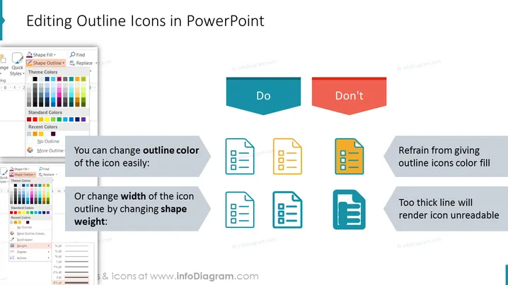
Die Folie trägt den Titel "Bearbeiten von Umrisssymbolen in PowerPoint" und ist wahrscheinlich ein Tutorial zur Anpassung von Symbolen innerhalb der Präsentationssoftware. Sie veranschaulicht die besten Praktiken mit einem "Do" und "Don't"-Ansatz. Die "Do"-Seite schlägt vor, dass Sie die Farbe des Umrisses eines Symbols leicht ändern oder die Umrissbreite des Symbols anpassen können, indem Sie das Formgewicht ändern. Diese Aktionen bewahren die Klarheit der Symbole. Im Gegensatz dazu rät die "Don't"-Seite davon ab, Umrisssymbole mit Farbe zu füllen und von der Verwendung von übermäßig dicken Linien, da diese die Lesbarkeit der Symbole verringern können.
Der Gesamteindruck der Folie ist sauber und professionell, mit einer klaren Unterscheidung zwischen empfohlenen und nicht empfohlene Praktiken. Die Verwendung von Blau für positive Aktionen und Rot für negative bietet einen intuitiven visuellen Hinweis für die Betrachter.


