Your graphics add a nice touch to my presentations and I recently used them for one of my all-hands meetings. Your toolbox adds professionalism to my slides. Instead of using standard clipart.
Claude Jones, Director of Engineer, @Walmartlabs, USA
Your graphics add a nice touch to my presentations and I recently used them for one of my all-hands meetings. Your toolbox adds professionalism to my slides. Instead of using standard clipart.
Claude Jones, Director of Engineer, @Walmartlabs, USA
I needed a fresh look at some of my slides. I've tried to find a way to create a paintbrush effect, to underline, accentuate, add some color and the handwritten markers were just the things. Very easy to use, easy to size, change the color. It was an affordable, perfect solution and I'm happy to recommend it.
Anonymous, US
The crisp, clean look of the graphics, and the fact that it allowed me to easily edit and change the colors to match the template was my main reason for purchasing them.
Brandie Jenkins, E-learning Developer, USA
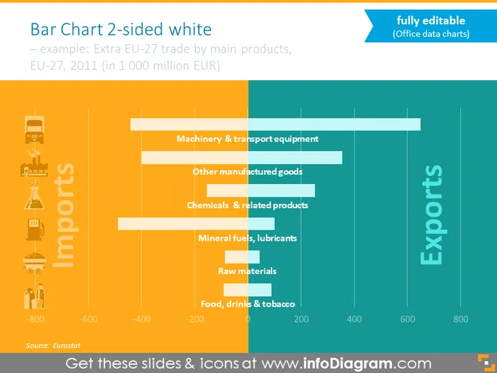
Die Folie präsentiert ein beidseitiges horizontales Balkendiagramm, das die Importe und Exporte der EU-27 im Jahr 2011 vergleicht. Es zeigt Daten zum Handel nach Hauptproduktkategorien in Milliarden EUR. Bei den Importen sind die Kategorien von unten aufgelistet: Lebensmittel, Getränke & Tabak; Rohstoffe; Mineralöle, Schmierstoffe; Chemikalien & verwandte Produkte; Sonstige Industriegüter; sowie Maschinen & Transportausrüstungen. Jede dieser Kategorien zeigt einen negativen Wert, der das für Importe ausgegebene Geld darstellt. Bei den Exporten sind die Werte positiv, was darauf hindeutet, dass Einnahmen erzielt wurden.
Das Gesamtbild der Folie ist professionell und visuell ausgewogen, mit einem klaren Kontrast zwischen den Import- (orange) und Export- (blau) Daten. Die Symbole und die Farbabstufung machen die Daten leicht lesbar und visuell ansprechend.


