Your graphics add a nice touch to my presentations and I recently used them for one of my all-hands meetings. Your toolbox adds professionalism to my slides. Instead of using standard clipart.
Claude Jones, Director of Engineer, @Walmartlabs, USA
Your graphics add a nice touch to my presentations and I recently used them for one of my all-hands meetings. Your toolbox adds professionalism to my slides. Instead of using standard clipart.
Claude Jones, Director of Engineer, @Walmartlabs, USA
I needed a fresh look at some of my slides. I've tried to find a way to create a paintbrush effect, to underline, accentuate, add some color and the handwritten markers were just the things. Very easy to use, easy to size, change the color. It was an affordable, perfect solution and I'm happy to recommend it.
Anonymous, US
The crisp, clean look of the graphics, and the fact that it allowed me to easily edit and change the colors to match the template was my main reason for purchasing them.
Brandie Jenkins, E-learning Developer, USA
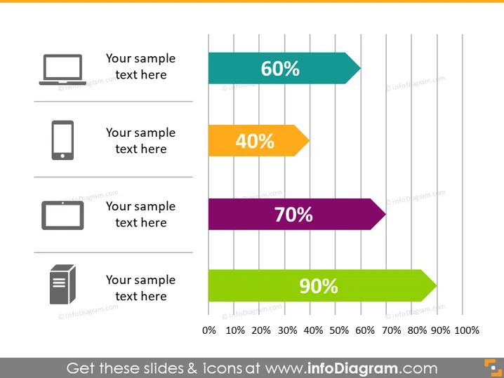
Die PowerPoint-Folie präsentiert einen Leistungsvergleich mithilfe von horizontalen Balkendiagrammen. Jeder Balken stellt einen Prozentsatz dar, der mit einer fetten Prozentzahl beschriftet ist. Vier Elemente sind aufgeführt, die jeweils einen Balken in einer anderen Farbe repräsentieren und 60%, 40%, 70% und 90% darstellen. Diese Prozentsätze könnten Metriken wie Produktivitätsniveaus, Zielerreichungen oder andere quantifizierbare Ergebnisse veranschaulichen. Jedes Element hat ein zugehöriges Symbol: einen Desktop-Monitor, ein Mobiltelefon, einen Drucker und ein Dokument, die verschiedene Bereiche der Technologie oder Aspekte eines Unternehmens symbolisieren könnten.
Das Gesamtbild der Folie ist modern und klar, mit einem deutlichen Schwerpunkt auf der grafischen Darstellung von Daten. Der Einsatz von Farben und Symbolen ist effektiv, um Informationen auf einen Blick zu vermitteln.


